

We have a Steam curator now. You should be following it. https://store.steampowered.com/curator/44994899-RPGHQ/
Which RPGs do you think have exceptional GUIs?
-
rusty_shackleford

- Site Admin
- Posts: 46432
- Joined: Feb 2, '23
- Gender: Watermelon
-
Geolocation
Adventurer's Guild
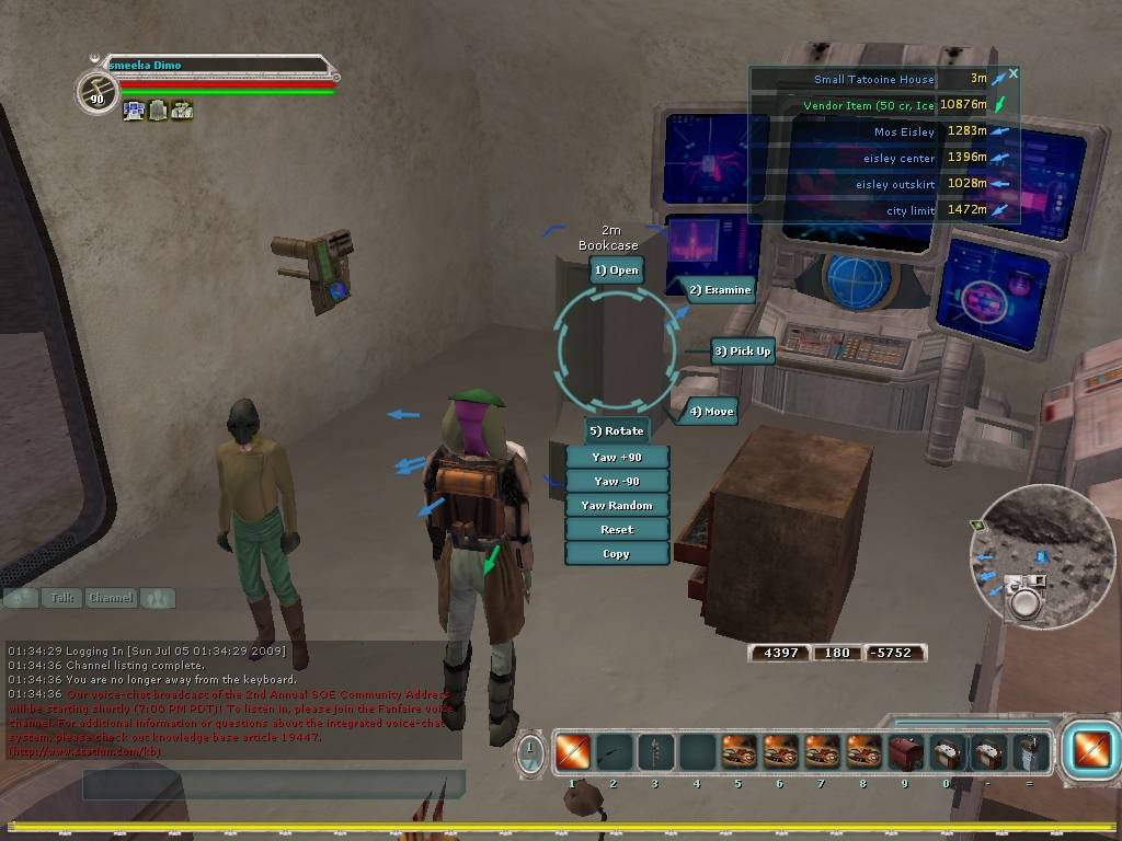
Star Wars Galaxies has a nice radial menu. Difficult to find a good screenshot.
Thank you for your attention to this matter!
Steam friend code: 40552640 https://steamcommunity.com/friends/add | email: [email protected]
Having trouble running an old Windows game?
Rusty's Stuff Collection
Steam friend code: 40552640 https://steamcommunity.com/friends/add | email: [email protected]
Having trouble running an old Windows game?
Rusty's Stuff Collection
-
Klerik

- Posts: 982
- Joined: Mar 9, '23
-
Geolocation
Deus Ex has the best UI and all of your **** is organized correctly and doesn't look like a splattered mess of ****. No one has replicated it since. Escape from Tarkov is up there but that's not an RPG. ARMA is up there but that's not an RPG.
Yar Pee Gee! Yar!
XCOM is an RPG and it has a good UI. I don't care what you say.
Yar Pee Gee! Yar!
XCOM is an RPG and it has a good UI. I don't care what you say.
Brillo-pad Activated.
-
Acrux

- Turtle

- Posts: 6747
- Joined: Feb 8, '23
-
Geolocation
Adventurer's Guild
Well, I may have also conducted some of the research myself as well.J1M wrote: ↑ May 7th, 2023, 02:19I believe you saw studies with that as the abstract, but I think if you dig into the details you would find that the radial menus in the study both do not have slices of text at weird angles as mouse targets and the total number of options on that radial menu is not comparable to ToEE.Acrux wrote: ↑ May 6th, 2023, 15:12Surprisingly, there's a lot of UX research that suggests radial menus are exceptionally effective at helping people select targets more quickly and accurately for mouse targets, and that they are good for building muscle memory of where things are located. They also tend to be better for performance than lists if there are 2-3 levels of submenus. The main drawback against them has been infrequent use makes them seem intimidating and unfamiliar at first.
Your points about the keyboard shortcuts is important - too many games lately don't allow keyboard reconfiguration.
Angled text on radial menus is pretty common. I'm not sure on the number of items in the top- and sub-level nav menus in TOEE. I do think it's a little higher than average, but certainly not the most extreme out there.
I'm not saying you have to love radial menus. But there's a lot of evidence that for performance it works pretty well. I'm reminded of an argument I had with a guy over a decade ago about "dark mode" vs standard dark text on light background. There's been a lot of research done on that, and purely on performance (reading speed, comprehension, stamina for reading over a long period of time), dark text on light background is best. The guy got really mad because he liked dark mode. Like, I don't care what you want to use, I'm just saying there's a lot of evidence on the measurements around them. Obviously, a lot of people seem to prefer not using radial menus (and using dark mode).
-
GhostCow

- Turtle
- Posts: 3304
- Joined: Feb 3, '23
- Gender: Dinosaur
-
Geolocation
I've heard the thing about dark mode before and it's pretty surprising to me. White backgrounds with black text feel like they are burning out my retinas. My monitor is pretty **** bright though.
☆HQ Defense Force☆
-
WhiteShark

- Site Moderator
- Posts: 5056
- Joined: Feb 2, '23
-
Geolocation
Adventurer's Guild
Yeah, color me skeptical. I can see this being true if the study was done on a very dimly lit display, but on a bright display I'm 100% with GhostCow: dark text on light background makes my eyes burn.Acrux wrote: ↑ May 7th, 2023, 03:58I'm reminded of an argument I had with a guy over a decade ago about "dark mode" vs standard dark text on light background. There's been a lot of research done on that, and purely on performance (reading speed, comprehension, stamina for reading over a long period of time), dark text on light background is best.
-
KnightoftheWind

- Posts: 3528
- Joined: Feb 27, '23
-
Geolocation
List based inventories are only necessary if a game relies on obtaining, organizing and selling hundreds of different items. For titles that aren't loot-based, icon based inventories are superior. In fact it makes me wish more RPGs weren't so loot-heavy, imagine if the next Elder Scrolls only let you use a certain roster of weapons and armor like a Zelda game. Maybe then the developers would have to design better environments and quests that are more then "clear out cave to get the Dagger of Alexion".
-
J1M

- Turtle
- Posts: 5214
- Joined: Feb 15, '23
-
Geolocation
Adventurer's Guild
We don't have to be in the room to know the study wasn't conducted at midnight in a dark basement. In an office environment with moderate brightness the result is not surprising. Personally, I would like to see a quick OS toggle that apps respect so that color mode can be easily toggled based on time of day and lighting.WhiteShark wrote: ↑ May 7th, 2023, 04:44Yeah, color me skeptical. I can see this being true if the study was done on a very dimly lit display, but on a bright display I'm 100% with GhostCow: dark text on light background makes my eyes burn.Acrux wrote: ↑ May 7th, 2023, 03:58I'm reminded of an argument I had with a guy over a decade ago about "dark mode" vs standard dark text on light background. There's been a lot of research done on that, and purely on performance (reading speed, comprehension, stamina for reading over a long period of time), dark text on light background is best.
-
Lich

- Turtle
- Posts: 2688
- Joined: Feb 6, '23
-
Geolocation
-
WhiteShark
- Site Moderator
- Posts: 5056
- Joined: Feb 2, '23
-
Geolocation
Adventurer's Guild
I think the SWG one looks okay since the text isn't rotated.
-
Lich
- Turtle
- Posts: 2688
- Joined: Feb 6, '23
-
Geolocation
The SWG one is less bad since it fits the sci-fi theme. The ToEE one feels too modern for the game's setting. The worst part is the text isn't aligned parallel or perpendicular to the borders of the screen.
-
J1M
- Turtle
- Posts: 5214
- Joined: Feb 15, '23
-
Geolocation
Adventurer's Guild
Studies have also shown that real-time action games are more popular than turn-based RPGs.
-
Tweed

- Turtle
- Posts: 6995
- Joined: Feb 2, '23
-
Geolocation
Adventurer's Guild
If you think U7's inventory is bad you should see Anvil of Dawn's.rusty_shackleford wrote: ↑ May 7th, 2023, 01:42I know people don't want accurately modeled volume because it was tried and universally reviled.Klerik wrote: ↑ May 7th, 2023, 01:40Now we're talking about what people want when you have no ******* idea what people ******* want. Might as well put big black dicks and more inclusivity, and some bud light, because that's what people want.
-
rusty_shackleford
- Site Admin
- Posts: 46432
- Joined: Feb 2, '23
- Gender: Watermelon
-
Geolocation
Adventurer's Guild
re: dark vs light-mode efficiency, I wonder if the study bothered controlling for the mode the users typically use. Someone switching from one to another for the study would likely see a decrease in efficiency.
Thank you for your attention to this matter!
Steam friend code: 40552640 https://steamcommunity.com/friends/add | email: [email protected]
Having trouble running an old Windows game?
Rusty's Stuff Collection
Steam friend code: 40552640 https://steamcommunity.com/friends/add | email: [email protected]
Having trouble running an old Windows game?
Rusty's Stuff Collection
-
Acrux
- Turtle
- Posts: 6747
- Joined: Feb 8, '23
-
Geolocation
Adventurer's Guild
Yeah, good point. The stuff I was familiar with (back around 2003 or so) was before dark mode really became popular after monochrome CRT faded, so I know for sure that it did not.
I found a meta-analysis done a couple of years ago but I don't see familiarity explicitly called out.
https://www.nngroup.com/articles/dark-mode/
I found a meta-analysis done a couple of years ago but I don't see familiarity explicitly called out.
https://www.nngroup.com/articles/dark-mode/
-
WhiteShark
- Site Moderator
- Posts: 5056
- Joined: Feb 2, '23
-
Geolocation
Adventurer's Guild
The above mentions that positive contrast polarity (black text on white background) may lead to myopia; I wonder if already being myopic is at all related to my subjective preference between the two. It's interesting that low-light conditions are where positive contrast polarity enjoys the most advantage, as that's precisely when I find it most painful to use.
I'm also curious now about configurations other that black-on-white and white-on-black. For example, I've used this color scheme in np++ for a while now:
(High magnification because I keep that on my third monitor which is situated a bit far from me)
I'm also curious now about configurations other that black-on-white and white-on-black. For example, I've used this color scheme in np++ for a while now:
(High magnification because I keep that on my third monitor which is situated a bit far from me)
-
Acrux
- Turtle
- Posts: 6747
- Joined: Feb 8, '23
-
Geolocation
Adventurer's Guild
That reminds me - I'm more positively inclined to any game that provides good UI scaling. I've skipped several games that seemed good just because the UI elements or fonts were too small for me to see clearly.WhiteShark wrote: ↑ May 8th, 2023, 07:58
(High magnification because I keep that on my third monitor which is situated a bit far from me)
-
Cedric

- Posts: 353
- Joined: Feb 3, '23
-
Geolocation
Surprisingly I think NWN's UI holds up the best, especially when dealing with real time multiplayer servers. The DM Client is also utilitarian but very functional.