Arx Fatalis. It's endlessly customizeable and the immersion you get from placing items into your inventory is something I've never seen any other game do.
Either the entire UI, or just a part you want to highlight.
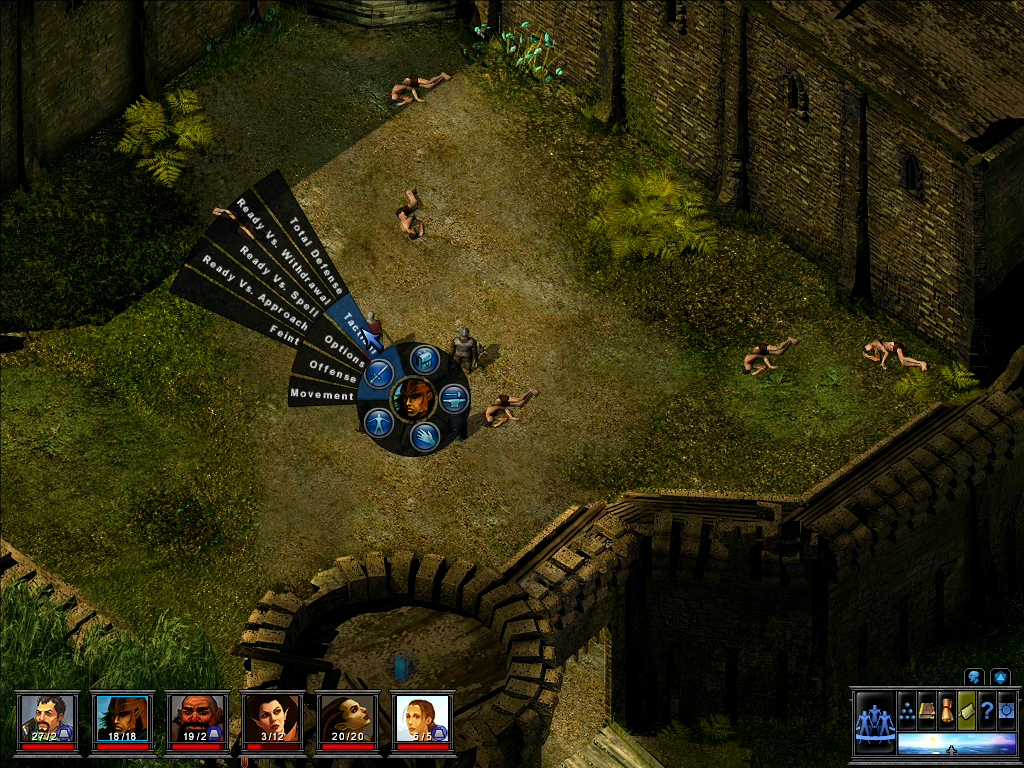
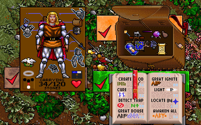
Temple of Elemental Evil has possibly one of the best GUIs overall.
The layered radial menu:
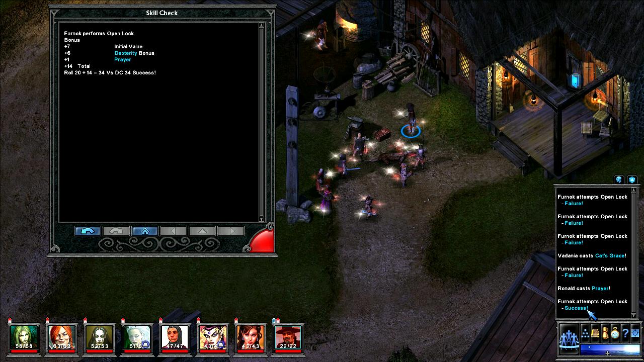
The combat log:
Which was itself closely intertwined with the ingame 'manual'. All the blue text in that image is a link you can click on.
Genuinely a **** shame NWN became popular instead of ToEE.
ToEE is a great game, but ironically when I saw the thread title I intended to post the radial menu as an example of why radial menus are exceptionally bad.
The ToEE one was implemented well, but it still has text at weird angles, no clear keyboard shortcuts, and irregular mouse targets.
Surprisingly, there's a lot of UX research that suggests radial menus are exceptionally effective at helping people select targets more quickly and accurately for mouse targets, and that they are good for building muscle memory of where things are located. They also tend to be better for performance than lists if there are 2-3 levels of submenus. The main drawback against them has been infrequent use makes them seem intimidating and unfamiliar at first.
Your points about the keyboard shortcuts is important - too many games lately don't allow keyboard reconfiguration.
Like my posts? Consider a donation: PayPal
Hate my posts? Consider a donation: PayPal
Indifferent to my posts? Consider a donation: PayPal
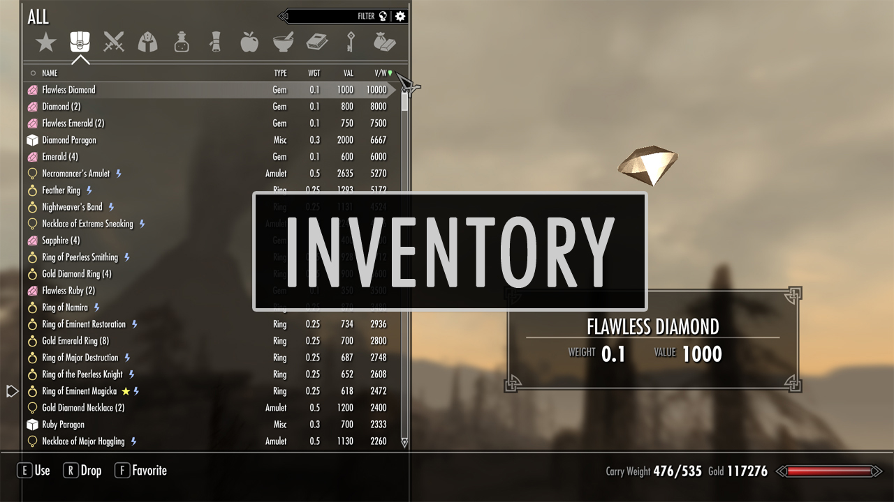
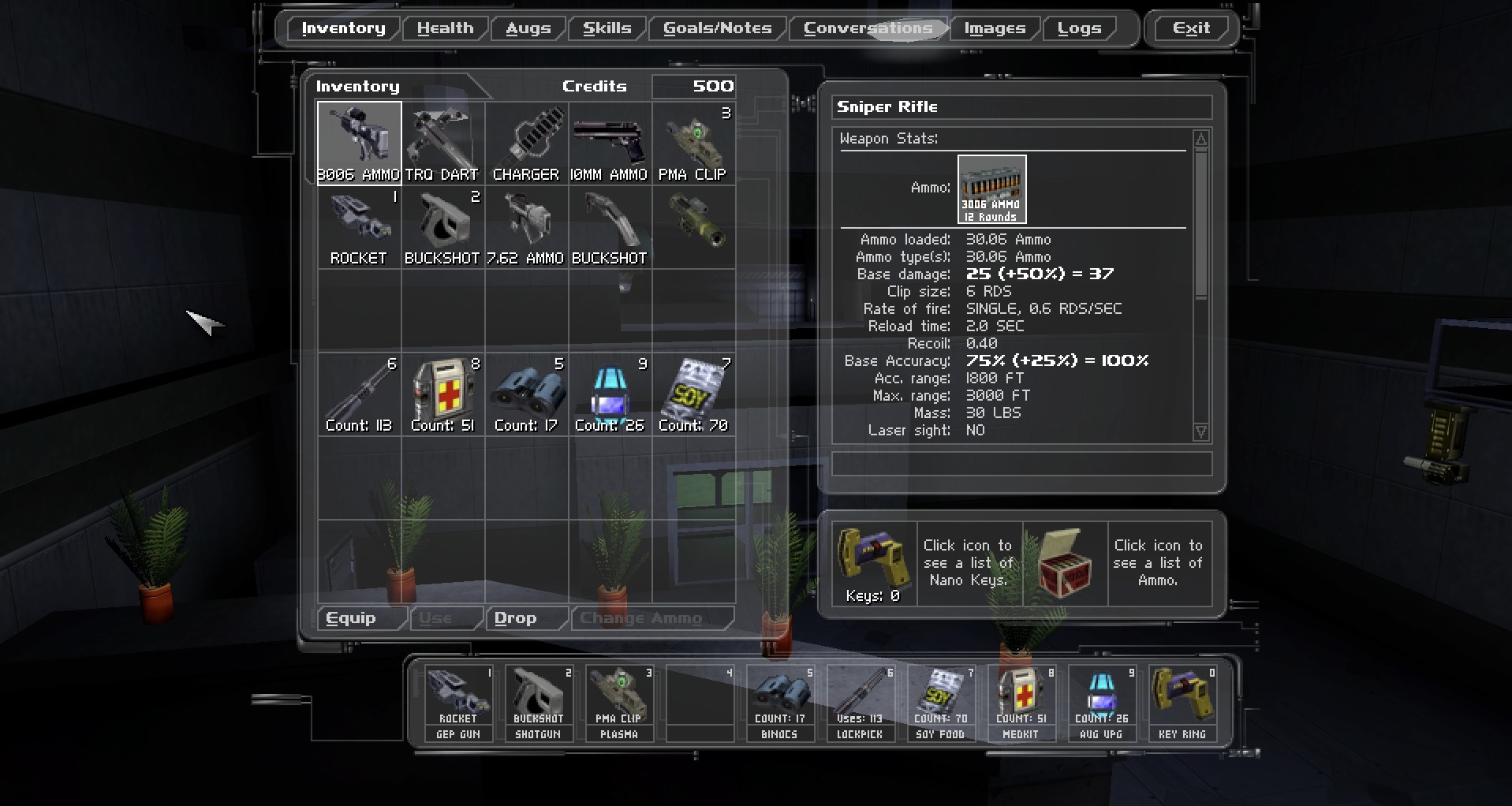
It's funny that you have to mod a bethesda game to get a good inventory.
And also no, they aren't trash. They take into account space as well as item weight. It doesn't matter if a cardboard box is only 2 lbs if it takes up an area the size of your fat ***.
And also no, they aren't trash. They take into account space as well as item weight. It doesn't matter if a cardboard box is only 2 lbs if it takes up an area the size of your fat ***.
It just models volume, nothing is stopping list-based inventories from doing this.
Oh now we're talking about doesn't=exist-ium in a thread about RPGS that actually ******* exist aren't we
Because people don't actually want that level of autism.
At least it would actually approximate real life though, tetris-based is a minigame plastered on top of a real game.
Now we're talking about what people want when you have no ******* idea what people ******* want. Might as well put big black dicks and more inclusivity, and some bud light, because that's what people want.
Now we're talking about what people want when you have no ******* idea what people ******* want. Might as well put big black dicks and more inclusivity, and some bud light, because that's what people want.
I know people don't want accurately modeled volume because it was tried and universally reviled.
Wow that looks cool. I haven't played that. Looks like something communist neckbeard feminist weirdos that have it too good in their sanfrancisco highrise smoking crack and writing **** articles all day long for a 200,000 salary might ***** about because they want to make something that people react to.
I've skipped all the Ultima games because they didn't look quite like my cup of tea to be honest, and I am too young to have grown up in the 286-386 days of rpgs.
I stand by my claim. At best you might be able to tell what kind of item it is at a glance, and nothing more. You have to mouse over each individual element to figure out what the items are.
There's a reason warehouses don't use a big collection of icons to manage their inventory.
True enough. I think, at least in Siege of Avalon's case, that's an intended part of the game: sometimes an item that has better stats looks identical to the dozens of other swords you've come across.
I don't think SoA has a great interface, by the way. I love the game (it's probably in my top 5 rpgs despite the terrible combat), and I have a soft spot for the inventory and paperdoll, but the UI is pretty obtuse.
Like my posts? Consider a donation: PayPal
Hate my posts? Consider a donation: PayPal
Indifferent to my posts? Consider a donation: PayPal
Surprisingly, there's a lot of UX research that suggests radial menus are exceptionally effective at helping people select targets more quickly and accurately for mouse targets, and that they are good for building muscle memory of where things are located. They also tend to be better for performance than lists if there are 2-3 levels of submenus. The main drawback against them has been infrequent use makes them seem intimidating and unfamiliar at first.
Your points about the keyboard shortcuts is important - too many games lately don't allow keyboard reconfiguration.
I believe you saw studies with that as the abstract, but I think if you dig into the details you would find that the radial menus in the study both do not have slices of text at weird angles as mouse targets and the total number of options on that radial menu is not comparable to ToEE.