

I have not played this game (yet, if ever at this point) and that with the misc tab and the carry weight already made me put my hands in my hairVergil wrote: ↑ April 27th, 2025, 05:00It is sort of impressive how they managed to suck almost all of the soul out of the UI's visuals but without even the benefit of making it more functional. It's actually less detailed, more cluttered, and still fits an extremely pathetic pitiful amount of information on screen at once.
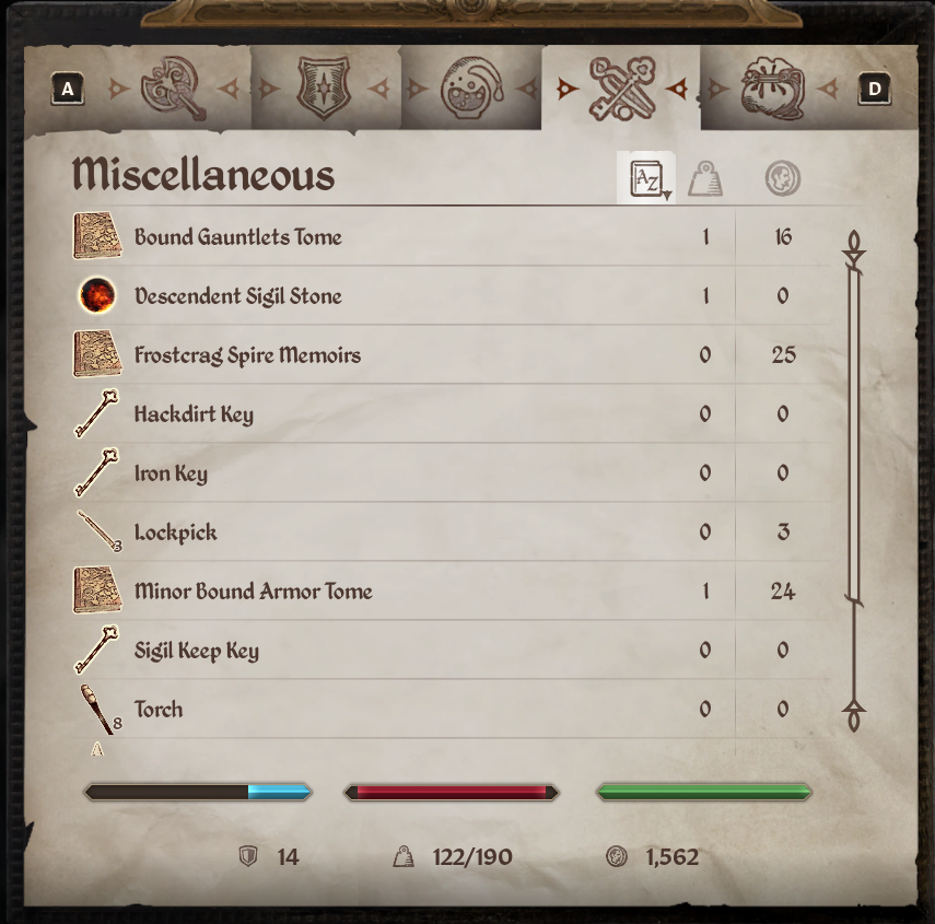
Look at this ****. The misc tab was already a disaster in the base game due to waaaaay too many things being considered "misc" but now there's not even the categories separating them. Now my books, keys, scrolls, soul gems and random crap all have to be sorted together in either alphabetical, weight, or gold value that's *it*.
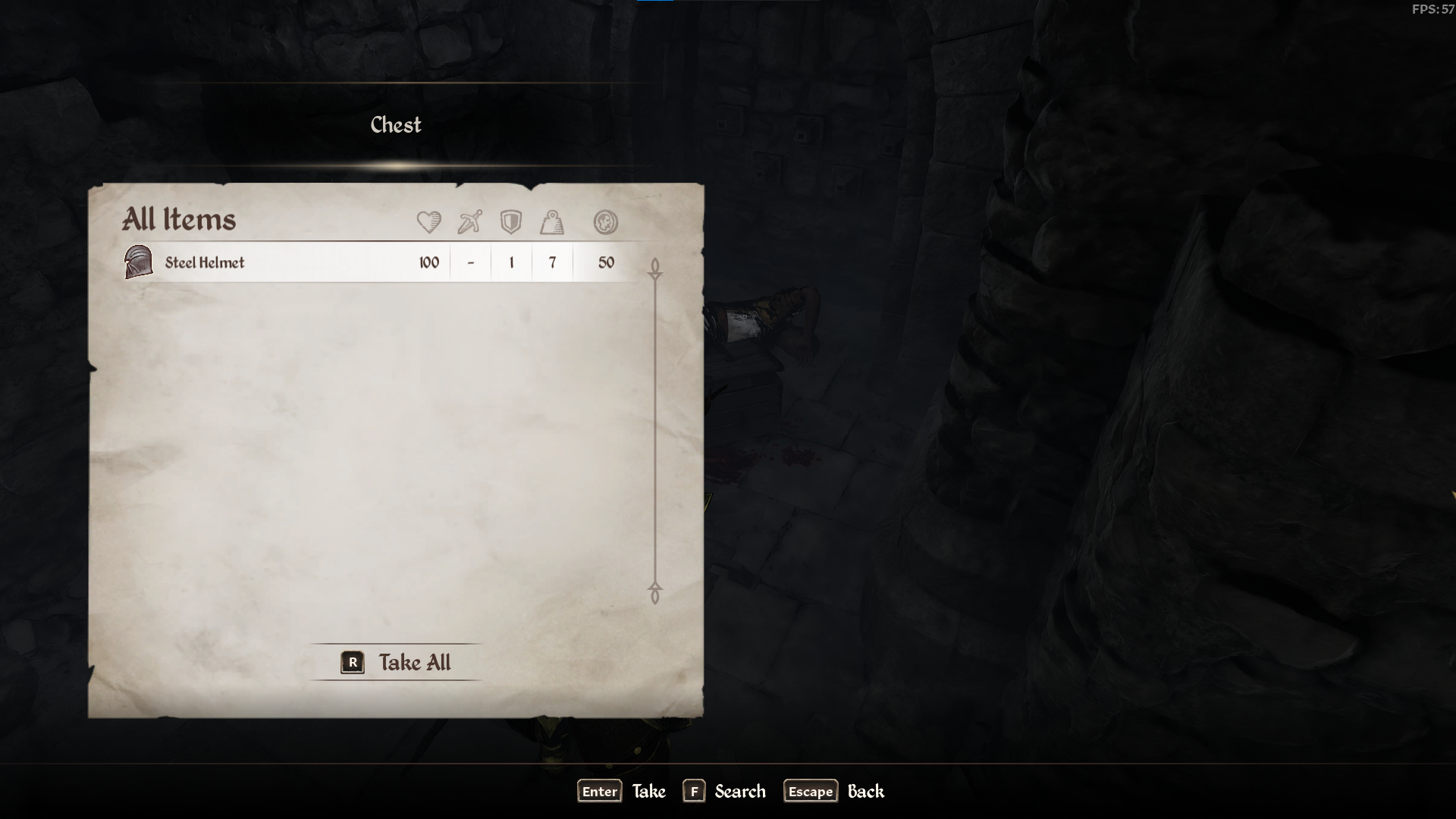
Looting is made worse too. I have no ******* idea what my current encumbrance is now just from a glance. I have to hit an extra key (labeled "search" for some ******* reason) to bring up a menu more like normal Oblivion where I can see my inventory next to whatever I'm looking at. There's no reason for it either. There's a huge **** off empty space to the side that's used by nothing so it's not like they've expanded the window so you can see more items if there's a lot of stuff in a container (which is basically never an issue anyway).
How are the sounds of the UI? Did they leave those in at least?