We have a Steam curator now. You should be following it. https://store.steampowered.com/curator/44994899-RPGHQ/
Chat client updated, if you have issues using chat press CTRL + SHIFT + R to force a hard refresh.

Badges

Participate in a new RPG each month with other members of the HQ
Ignore Topic
User avatar
Silver
Posts: 471
Joined: Dec 4, '23

Geolocation

Post by Silver »

J1M wrote: December 11th, 2024, 03:15
The border color preference was pretty clear. Here is some exploration of different shapes for the pin to evoke the idea of a shield.

Image
3rd one is the best (imo).
The 4th and 5th options are too... squiggly? Like someone took a tin can and hand crushed it in the middle.
While 3rd option reads like a badge / pin. :salute:
Finarfin wrote: December 10th, 2024, 19:37
Hell yeah. Like on the Path of Exile Forum.

Image
Ngl, I love this wall of fame. It's so over the top I can't find it in me to hate on it.
Last edited by Silver on December 11th, 2024, 18:19, edited 1 time in total.
User avatar
J1M
Turtle
Turtle
Posts: 5068
Joined: Feb 15, '23

Geolocation

Adventurer's Guild

Post by J1M »

Examples of what I was talking about regarding the pins for older games. A couple of them could probably use a darker color on the left. Also an alternative pin for Of Orcs & Men to address the comments of the current one looking pretty generic.

Image
User avatar
logincrash
The Music Man
Posts: 6040
Joined: Sep 3, '23
Location: Niger

Geolocation

Adventurer's Guild

Post by logincrash »

J1M wrote: December 12th, 2024, 02:37
Examples of what I was talking about regarding the pins for older games. A couple of them could probably use a darker color on the left. Also an alternative pin for Of Orcs & Men to address the comments of the current one looking pretty generic.

Image
Some color combos make it look like the icon is off-center (numbers 2, 4, 7). Otherwise, it looks pretty good.
"Oh, it all makes sense now, brother."
User avatar
J1M
Turtle
Turtle
Posts: 5068
Joined: Feb 15, '23

Geolocation

Adventurer's Guild

Post by J1M »

Last edited by J1M on January 30th, 2025, 22:57, edited 10 times in total.
User avatar
rusty_shackleford
Site Admin
Posts: 45455
Joined: Feb 2, '23
Gender: Watermelon

Geolocation

Adventurer's Guild

Post by rusty_shackleford »

I liked the little amulet for the strahd badge because it's the key item you're supposed to find.
Thank you for your attention to this matter!
Steam friend code: 40552640 https://steamcommunity.com/friends/add | email: [email protected]
Having trouble running an old Windows game?
Rusty's Stuff Collection
User avatar
Silver
Posts: 471
Joined: Dec 4, '23

Geolocation

Post by Silver »

J1M wrote: December 13th, 2024, 02:09
@Oyster Sauce

Image Image Image

Image Image Image

Image

Image Image Image

Image Image Image

Image Image Image

Image Image
Are those the final badges?
User avatar
J1M
Turtle
Turtle
Posts: 5068
Joined: Feb 15, '23

Geolocation

Adventurer's Guild

Post by J1M »

That's a question for @Oyster Sauce.

The significant decline in controversy and complaining implies they have passed a quality threshold.

EDIT: We have 3(?) threads with tables in various states of showing a list of games and badges. Would recommend some of those just redirect to the Adventurer's Guild Games » History, Suggestions, & Upcoming thread instead so it is easier to maintain.
Last edited by J1M on December 16th, 2024, 01:14, edited 1 time in total.
User avatar
Oyster Sauce
Site Moderator
Posts: 11291
Joined: Jun 2, '23

Geolocation

Adventurer's Guild

Post by Oyster Sauce »

J1M wrote: December 16th, 2024, 01:10
That's a question for @Oyster Sauce.

The significant decline in controversy and complaining implies they have passed a quality threshold.

EDIT: We have 3(?) threads with tables in various states of showing a list of games and badges. Would recommend some of those just redirect to the Adventurer's Guild Games » History, Suggestions, & Upcoming thread instead so it is easier to maintain.
Looks good to me
User avatar
J1M
Turtle
Turtle
Posts: 5068
Joined: Feb 15, '23

Geolocation

Adventurer's Guild

Post by J1M »

Added dark sun pin to this post.

Updated Crystals of Arborea because it had the same foreground shape.
User avatar
J1M
Turtle
Turtle
Posts: 5068
Joined: Feb 15, '23

Geolocation

Adventurer's Guild

Post by J1M »

@rusty_shackleford

Nit: The ordering of the Shattered Lands pin should probably be adjusted so it appears between Strahd and Alpha Protocol.
User avatar
rusty_shackleford
Site Admin
Posts: 45455
Joined: Feb 2, '23
Gender: Watermelon

Geolocation

Adventurer's Guild

Post by rusty_shackleford »

J1M wrote: December 16th, 2024, 03:05
@rusty_shackleford

Nit: The ordering of the Shattered Lands pin should probably be adjusted so it appears between Strahd and Alpha Protocol.
I think all the badges need reordered :scratch:
Thank you for your attention to this matter!
Steam friend code: 40552640 https://steamcommunity.com/friends/add | email: [email protected]
Having trouble running an old Windows game?
Rusty's Stuff Collection
User avatar
logincrash
The Music Man
Posts: 6040
Joined: Sep 3, '23
Location: Niger

Geolocation

Adventurer's Guild

Post by logincrash »

J1M wrote: December 13th, 2024, 02:09
@Oyster Sauce

Image Image Image

Image Image Image

Image Image

Image Image Image

Image Image Image

Image Image Image

Image Image
The Deus Ex Invisible War badge needs the icon to be moved right just by a pixel.
Image
"Oh, it all makes sense now, brother."
User avatar
rusty_shackleford
Site Admin
Posts: 45455
Joined: Feb 2, '23
Gender: Watermelon

Geolocation

Adventurer's Guild

Post by rusty_shackleford »

Oop, missed the amberland badge, ill fix it later
Thank you for your attention to this matter!
Steam friend code: 40552640 https://steamcommunity.com/friends/add | email: [email protected]
Having trouble running an old Windows game?
Rusty's Stuff Collection
User avatar
logincrash
The Music Man
Posts: 6040
Joined: Sep 3, '23
Location: Niger

Geolocation

Adventurer's Guild

Post by logincrash »

Also, the Alpha Protocol icon is unrecognizable. What the **** is that even supposed to be? The α was perfect.
"Oh, it all makes sense now, brother."
User avatar
1998
Posts: 2949
Joined: Jun 23, '23
Location: Beregost

Geolocation

Adventurer's Guild

Post by 1998 »

rusty_shackleford wrote: December 16th, 2024, 07:06
Oop, missed the amberland badge, ill fix it later
Hmm..guess time to check if I still have some save games for that one :smug:
My Reviews
Somnus [Not Recommended]
New Arc Line [Early Access] [Informational]
Passageway of the Ancients [Not Recommended]
Beyond Galaxyland [Recommended]
Old School RPG [Informational]
SKALD: The Black Priory [Recommended]

My Steam
38123774
User avatar
Irenaeus
Posts: 10784
Joined: Sep 29, '23

Geolocation

Post by Irenaeus »

logincrash wrote: December 16th, 2024, 07:19
Also, the Alpha Protocol icon is unrecognizable. What the **** is that even supposed to be? The α was perfect.
**** yeah, I was looking forward to having just an enigmatic α on my profile as soon as find time to finish the **** game.
User avatar
Red7
Posts: 7763
Joined: Aug 11, '23

Geolocation

Post by Red7 »

what is potato badge reference of? some irish or polish thing?
Last edited by Red7 on December 16th, 2024, 14:02, edited 1 time in total.
Thou shalt not SIMP
User avatar
J1M
Turtle
Turtle
Posts: 5068
Joined: Feb 15, '23

Geolocation

Adventurer's Guild

Post by J1M »

logincrash wrote: December 16th, 2024, 07:19
Also, the Alpha Protocol icon is unrecognizable. What the **** is that even supposed to be? The α was perfect.
It is the APGame.exe icon. Looks like Mike Thorton in profile holding a pistol.
Last edited by J1M on December 16th, 2024, 20:14, edited 1 time in total.
User avatar
J1M
Turtle
Turtle
Posts: 5068
Joined: Feb 15, '23

Geolocation

Adventurer's Guild

Post by J1M »

logincrash wrote: December 16th, 2024, 06:42
J1M wrote: December 13th, 2024, 02:09
@Oyster Sauce

Image Image Image

Image Image Image

Image Image

Image Image Image

Image Image Image

Image Image Image

Image Image
The Deus Ex Invisible War badge needs the icon to be moved right just by a pixel.
Image
Shameful. I have returned all of my compensation thus far to the institution.
User avatar
Silver
Posts: 471
Joined: Dec 4, '23

Geolocation

Post by Silver »

I didn't want to post this before, because I honestly assumed badges were still WIP. And I also didn't want to sound like a broken record, saying that images are off-centre again and that borders aren't equal etc

Here's a gif showing badges that are off-centre. And purple-green blocks are visualising just how off frame is (both left-right sides and top-bottom -- green is showcasing thicker side, purple is showcasing thinner side. There's no consistency in shadowing either, you can see that top and right side have like 1 pix worth of "shadow" but it only makes things look even more uneven, since the other side doesn't match.
Brown frame was at least visually equal -- the sides and the shadowing inside.

Image

Some of the brown badges were already off centre, but with new ones it's a whole another level of skewed. Sure, it's a small icon and it's not a big deal. But when you have lots of repeating small uncentered icons -- it shows.

Image

Thanks for hearing out the nagging of local OCD freak. :salute:
User avatar
rusty_shackleford
Site Admin
Posts: 45455
Joined: Feb 2, '23
Gender: Watermelon

Geolocation

Adventurer's Guild

Post by rusty_shackleford »

(unrelated to the nitpick stuff)
I think the badges look neat.
Thank you for your attention to this matter!
Steam friend code: 40552640 https://steamcommunity.com/friends/add | email: [email protected]
Having trouble running an old Windows game?
Rusty's Stuff Collection
User avatar
logincrash
The Music Man
Posts: 6040
Joined: Sep 3, '23
Location: Niger

Geolocation

Adventurer's Guild

Post by logincrash »

J1M wrote: December 16th, 2024, 14:02
logincrash wrote: December 16th, 2024, 07:19
Also, the Alpha Protocol icon is unrecognizable. What the **** is that even supposed to be? The α was perfect.
It is the APGame.exe icon. Looks liike Mike Thorton in profile holding a pistol.
It's too small and unreadable at this size. I thought it as a ****** up letter A when I first saw it. Darth Malak's face is too small on the badge as it is, nevermind this tiny greyscale Mike on a dark background.
"Oh, it all makes sense now, brother."
User avatar
J1M
Turtle
Turtle
Posts: 5068
Joined: Feb 15, '23

Geolocation

Adventurer's Guild

Post by J1M »

Silver wrote: December 16th, 2024, 17:31
I didn't want to post this before, because I honestly assumed badges were still WIP. And I also didn't want to sound like a broken record, saying that images are off-centre again and that borders aren't equal etc

Here's a gif showing badges that are off-centre. And purple-green blocks are visualising just how off frame is (both left-right sides and top-bottom -- green is showcasing thicker side, purple is showcasing thinner side. There's no consistency in shadowing either, you can see that top and right side have like 1 pix worth of "shadow" but it only makes things look even more uneven, since the other side doesn't match.
Brown frame was at least visually equal -- the sides and the shadowing inside.

Image

Some of the brown badges were already off centre, but with new ones it's a whole another level of skewed. Sure, it's a small icon and it's not a big deal. But when you have lots of repeating small uncentered icons -- it shows.

Image

Thanks for hearing out the nagging of local OCD freak. :salute:
I knew this was coming when you asked if they were final. :lol:

1. Appreciate whenever someone cares enough to provide detailed feedback. Would suggest you switch to nearest neighbor scaling if you are trying to scale these up to provide feedback.

2. The Bloodlines one is intentional, like an easter egg, because the image it is referencing was annoyingly off-center by 3 pixels all game. I don't mind changing it if people feel symmetry is more important.
Image

3. I feel like you are looking at these as flat images, when they are supposed to evoke the appearance of a pin. That is hard to do with so few pixels and that is why the border is intentionally non-uniform in width to imply depth. This also means that it could technically be argued that the center of the pin is at 16.5 pixels from the left side.

4. I'll be fixing the Deus Ex one that is clearly just off by a pixel.

5. The primary goal is a clear and distinct visual that looks good overall. KOTOR II is a good example of where it simply looked wrong to fixate on the middle of the mask instead of its overall width.
User avatar
J1M
Turtle
Turtle
Posts: 5068
Joined: Feb 15, '23

Geolocation

Adventurer's Guild

Post by J1M »

logincrash wrote: December 16th, 2024, 18:54
J1M wrote: December 16th, 2024, 14:02
logincrash wrote: December 16th, 2024, 07:19
Also, the Alpha Protocol icon is unrecognizable. What the **** is that even supposed to be? The α was perfect.
It is the APGame.exe icon. Looks liike Mike Thorton in profile holding a pistol.
It's too small and unreadable at this size. I thought it as a ****** up letter A when I first saw it. Darth Malak's face is too small on the badge as it is, nevermind this tiny greyscale Mike on a dark background.
There was a fair amount of negative feedback about the alpha symbol, which is why I dug up the game icon. If you have specific suggestions for Alpha Protocol I'm definitely open to changing it. It has probably been the most challenging one due to the generic setting, characters, and marketing.

I'm also open to changing the KOTOR icon. An early idea I had, but scrapped because it was technically from KOTOR II, was to use half of the KOTOR II mask plus a Roman numeral I/II beside it. I decided against this because I didn't like the idea of it being applied to Deus Ex 2. Another idea I could try is a blue lightsaber for KOTOR and a red one for KOTOR II, but the mask is so iconic I feel it would be a shame to lose it. Please share any specific suggestions you have for KOTOR.
Last edited by J1M on December 16th, 2024, 20:05, edited 1 time in total.
User avatar
logincrash
The Music Man
Posts: 6040
Joined: Sep 3, '23
Location: Niger

Geolocation

Adventurer's Guild

Post by logincrash »

J1M wrote: December 16th, 2024, 20:05
logincrash wrote: December 16th, 2024, 18:54
J1M wrote: December 16th, 2024, 14:02


It is the APGame.exe icon. Looks liike Mike Thorton in profile holding a pistol.
It's too small and unreadable at this size. I thought it as a ****** up letter A when I first saw it. Darth Malak's face is too small on the badge as it is, nevermind this tiny greyscale Mike on a dark background.
There was a fair amount of negative feedback about the alpha symbol, which is why I dug up the game icon. If you have specific suggestions for Alpha Protocol I'm definitely open to changing it. It has probably been the most challenging one due to the generic setting, characters, and marketing.

I'm also open to changing the KOTOR icon. An early idea I had, but scrapped because it was technically from KOTOR II, was to use half of the KOTOR II mask plus a Roman numeral I/II beside it. I decided against this because I didn't like the idea of it being applied to Deus Ex 2. Another idea I could try is a blue lightsaber for KOTOR and a red one for KOTOR II, but the mask is so iconic I feel it would be a shame to lose it. Please share any specific suggestions you have for KOTOR.
I wasn't complaining about KotOR icon, I was saying how unreadable the AP icon was due to small size. What was the negative feedback about the old icon? It was simple and instantly recognizable. It's everywhere in the game too. It's a no-brainer, just like the Deus Ex badge and the Darth Nihilus mask for the KotOR2.
"Oh, it all makes sense now, brother."
User avatar
Vergil
Posts: 15670
Joined: Sep 6, '23

Geolocation

Post by Vergil »

Lol you can't even tell what the alpha protocol one is now without hovering over it. Used to be one of the cooler ones.
How are you managing to make them even worse over time?
I'm just stating the facts.
Question is are you going to gargle the truth or swallow?
User avatar
Finarfin
Connoisseur of Slop
Posts: 5020
Joined: May 20, '24
Location: Tirion upon Túna

Geolocation

Adventurer's Guild

Post by Finarfin »

Why the hell is the AP Badge the mystery ***** thornton? Do the α again.
Steam code: 10514930
My Reviews:
El Matador RECOMMENDED
Dungeons of Sundaria NOT RECOMMENDED
VLADiK BRUTAL
RECOMMENDED
Ultimate Zombie Defense 2 INFORMATIONAL
Deathless: The Hero Quest RECOMMENDED
Door Kickers 2 RECOMMENDED
Folklands INFORMATIONAL
User avatar
Vergil
Posts: 15670
Joined: Sep 6, '23

Geolocation

Post by Vergil »

The Bloodlines one is intentional, like an easter egg, because the image it is referencing was annoyingly off-center by 3 pixels all game. I don't mind changing it if people feel symmetry is more important.
Also lol @ refusing to fix highly requested issues and instead making awful changes no one asked for
I'm just stating the facts.
Question is are you going to gargle the truth or swallow?
User avatar
Silver
Posts: 471
Joined: Dec 4, '23

Geolocation

Post by Silver »

@J1M, I appreciate greatly how calm and non-offended you are even after me bugging you about badges for some time now. It's very refreshing (for me) to encounter a person who doesn't take criticism as a personal offense and a threat lol.
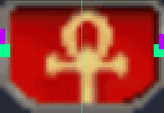
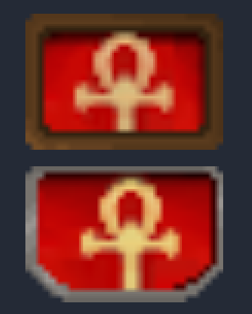
Bloodlines badge can be uneven I suppose. Trauma inducing asymmetry, but at least it has "backstory" to it.

I agree that the look should be visually distinct overall, but it doesn't mean it has to be sloppy while achieving it. Frame can be even. Shadows can be even. And the distinct PIN look is still there.

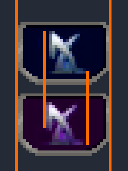
Here's a 3200% zoom (to see every pixel) on original pin and my edit, that was done on top to battle frame thickness being uneven and discolouration of said frame, that inevitably leads to muddiness when the image is of that tiny size. I kept all sides a pixel thicker except top one, brings out the 3d'ness of the badge the best:
► Show Spoiler
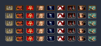
And here are the original badge and an edit side by side in 32 px size:

Image Image

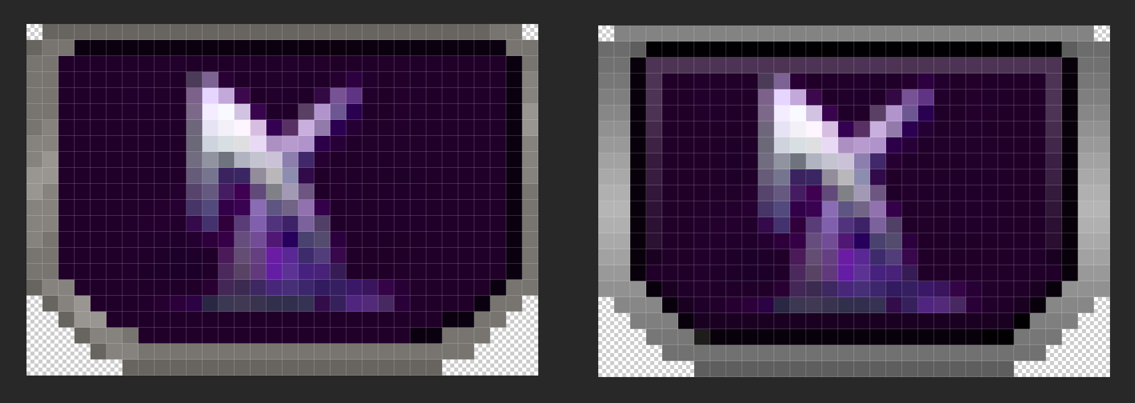
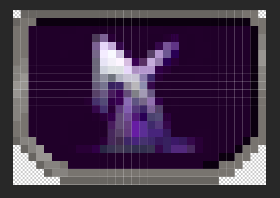
And here are some of edited badges together in 32 px size (I had old shard of spring pin on my PC, that's why I used it):

Image Image Image

Image Image Image

Original in same order:

Image Image Image

Image Image Image

While I still think 32 px width is a crime against human's eyes, there is more uniform definition to badges because literal pixels are so sharp and apart from each other. I added transparent inner black shadow, so that silver frame pops up more against light backgrounds instead of blending in (redemption, dao pins), but there's also 1 px worth of light and dark gradient that makes darker backgrounds stand out as well (deus ex, shard of spring pins).
It really ain't much, but the sharp clarity of said pixels brings a lot of uniformity to such small icons.
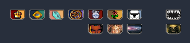
Here's a side by side size comparison of 32, 36 and 40 px badges accordingly. I think I missed the shadow on 40 px version, but it's more so to showcase size difference really.

Image Image Image

Just a random gif I made, 40 px as well:

Image

Badges of all sizes and shapes matter, of course, but I rrrreally really recommend at least 36 px. No one is taxing pixel real estate here on the profile, why don't just use it.
But then again, size is really not what's bothering me here at this point, it's more the inconsistency of it all.

As I said before, I actually got no clue what software is used for badges, maybe I blindly missed it. But here's a template / edit I made in PSD. So anyone can tweak with it and take / remove whichever changes they like.
► All three PSD pin sizes

I really hope my explanations and visualisations helped with something at least. I'm not out here trying to redesign anything that you, J1M, already made. I just wish it to look it's best self. :heart:
User avatar
J1M
Turtle
Turtle
Posts: 5068
Joined: Feb 15, '23

Geolocation

Adventurer's Guild

Post by J1M »

I think what you did with an accent color to make the image 'bubble up' looks nice. Somewhat the opposite of what I was going for which is an appearance of the content being set in a thin metal ridge, but it looks nice.

I'm not a professional artist or using anything more sophisticated than Paint.NET. I just wanted the forum to look less shabby so I volunteered to help.