

Ultima VI to VII had a major revamp in its UI, swapping to a style that may be referred to as "immersive" now — most of the UI was only present when needed.
Ultima VI:
Ultima VII, no UI other than the cursor as it's not needed at that time:
A very cluttered Ultima VII UI with many UI elements open:
I'm sure part of the reason for VI's UI was to limit the rendering area due to computers at the time.
(I'm disregarding fan remakes for the purpose of this thread, they add a lot of useful features, some related to UI.)
To those that played both games: Did you think VII's UI was an improvement?
To everyone: What are your favorite UIs in RPGs?
wind direction is sovl, by the way
We have a Steam curator now. You should be following it. https://store.steampowered.com/curator/44994899-RPGHQ/
Favorite UIs in RPGs?
-
rusty_shackleford

- Site Admin
- Posts: 45464
- Joined: Feb 2, '23
- Gender: Watermelon
-
Geolocation
Adventurer's Guild
Favorite UIs in RPGs?
You do not have the required permissions to view the files attached to this post.
Last edited by rusty_shackleford on March 29th, 2025, 02:14, edited 1 time in total.
Thank you for your attention to this matter!
Steam friend code: 40552640 https://steamcommunity.com/friends/add | email: [email protected]
Having trouble running an old Windows game?
Rusty's Stuff Collection
Steam friend code: 40552640 https://steamcommunity.com/friends/add | email: [email protected]
Having trouble running an old Windows game?
Rusty's Stuff Collection
Tags:
-
Vergil

- Posts: 15670
- Joined: Sep 6, '23
-
Geolocation
Oblivion's UI had functionality issues but it certainly had no issues when it came to be absolutely gorgeous. I despise the ****** *** minimalism of Skyrim.
I'm just stating the facts.
Question is are you going to gargle the truth or swallow?
Question is are you going to gargle the truth or swallow?
-
Oyster Sauce

- Site Moderator
- Posts: 11293
- Joined: Jun 2, '23
-
Geolocation
Adventurer's Guild
Assassin's Creed Valhalla
-
rusty_shackleford
- Site Admin
- Posts: 45464
- Joined: Feb 2, '23
- Gender: Watermelon
-
Geolocation
Adventurer's Guild
Not directly related to style, but Bethesda managing to make their UI functionally worse with every new game is impressive when they have clear examples of how to improve it in the form of mods.Vergil wrote: ↑ March 29th, 2025, 02:13Oblivion's UI had functionality issues but it certainly had no issues when it came to be absolutely gorgeous. I despise the ****** *** minimalism of Skyrim.
SkyUI is essentially Oblivion's inventory except extended.
Some guy made a vastly improved starfield UI mod while the game was still in head-start
Last edited by rusty_shackleford on March 29th, 2025, 02:16, edited 1 time in total.
Thank you for your attention to this matter!
Steam friend code: 40552640 https://steamcommunity.com/friends/add | email: [email protected]
Having trouble running an old Windows game?
Rusty's Stuff Collection
Steam friend code: 40552640 https://steamcommunity.com/friends/add | email: [email protected]
Having trouble running an old Windows game?
Rusty's Stuff Collection
-
Vergil
- Posts: 15670
- Joined: Sep 6, '23
-
Geolocation
Todd Howard said the only mods he used for Oblivion on PC was a UI mod. They have no excuse for this **** after that.rusty_shackleford wrote: ↑ March 29th, 2025, 02:15Not directly related to style, but Bethesda managing to make their UI functionally worse with every new game is impressive when they have clear examples of how to improve it in the form of mods.Vergil wrote: ↑ March 29th, 2025, 02:13Oblivion's UI had functionality issues but it certainly had no issues when it came to be absolutely gorgeous. I despise the ****** *** minimalism of Skyrim.
SkyUI is essentially Oblivion's inventory except extended.
Some guy made a vastly improved starfield UI mod while the game was still in head-start
I'm just stating the facts.
Question is are you going to gargle the truth or swallow?
Question is are you going to gargle the truth or swallow?
-
rusty_shackleford
- Site Admin
- Posts: 45464
- Joined: Feb 2, '23
- Gender: Watermelon
-
Geolocation
Adventurer's Guild
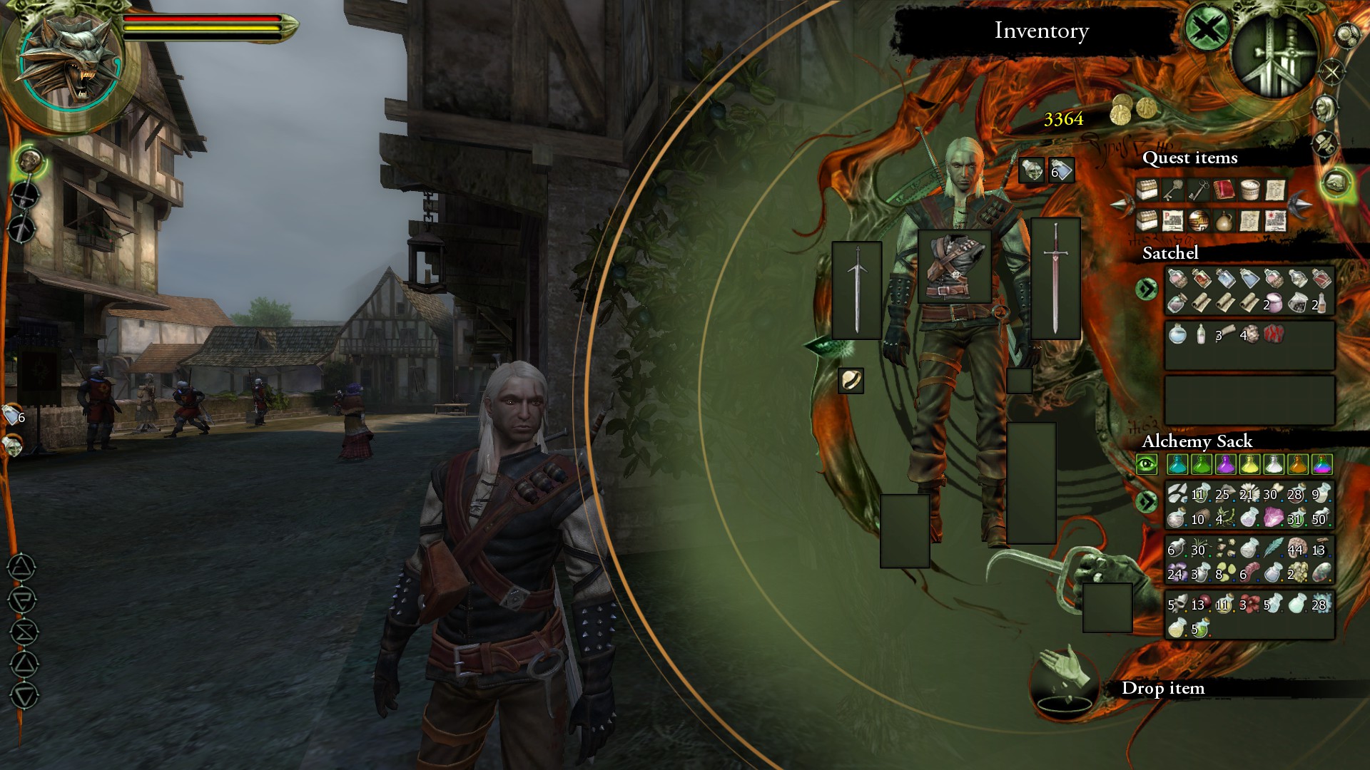
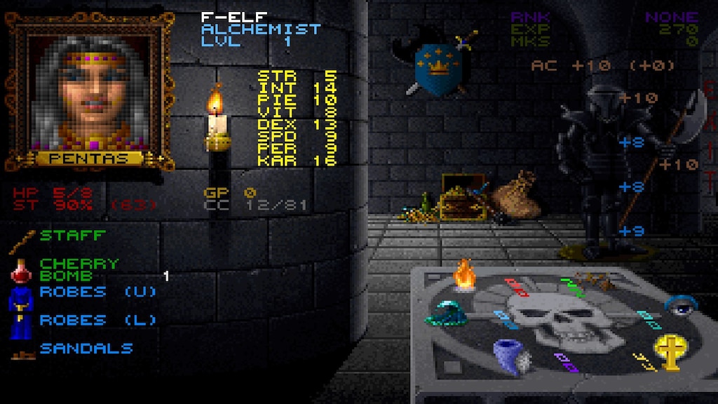
As much as I understand what they were going for with Ultima VII's diegetic bag interfaces, it's just too much. I don't know if anyone ever actually liked it, it was also used in UO, maybe Ultima 8? Never played it.
Larian somewhat copied the bag UI from Ultima VII(like many features in Larian games), but they just use icon-based inventories, which I dislike.
A more granular grid-based inventory would be fine for when dealing with volume, IMO. Add in the ability to rotate items on top of it.
Larian somewhat copied the bag UI from Ultima VII(like many features in Larian games), but they just use icon-based inventories, which I dislike.
Last edited by rusty_shackleford on March 29th, 2025, 02:21, edited 1 time in total.
Thank you for your attention to this matter!
Steam friend code: 40552640 https://steamcommunity.com/friends/add | email: [email protected]
Having trouble running an old Windows game?
Rusty's Stuff Collection
Steam friend code: 40552640 https://steamcommunity.com/friends/add | email: [email protected]
Having trouble running an old Windows game?
Rusty's Stuff Collection
-
Val the Moofia Boss

- Turtle

- Posts: 4198
- Joined: Jun 3, '23
-
Geolocation
Adventurer's Guild
I quite like the UIs of the latter Trails of Cold Steel games and the new Trails Through Daybreak series. You have information on the side so you get an unobstructed view of the art and combat in the center of the screen, and then the menus are nice enough. I like your ARCUS or Xipha flips open to reveal the quartz circuit board when you are building your characters. I also liked the gears/sci fi designs moving in the background image of the orbment screen of the first two Trails of Cold Steel games. I had to uninstall a lot of games to install FF7 Rebirth so I can't grab screenshots or GIFs of all of the things I am talking about real quick. I also thought it was cool how in Daybreak, the holo cores each have a unique voice and personality and will talk as you are flipping through screens or changing out the quartz in your Xipha.

I also thought it was cool how the SCLM radius in Daybreak was represented by in universe holographic rings.
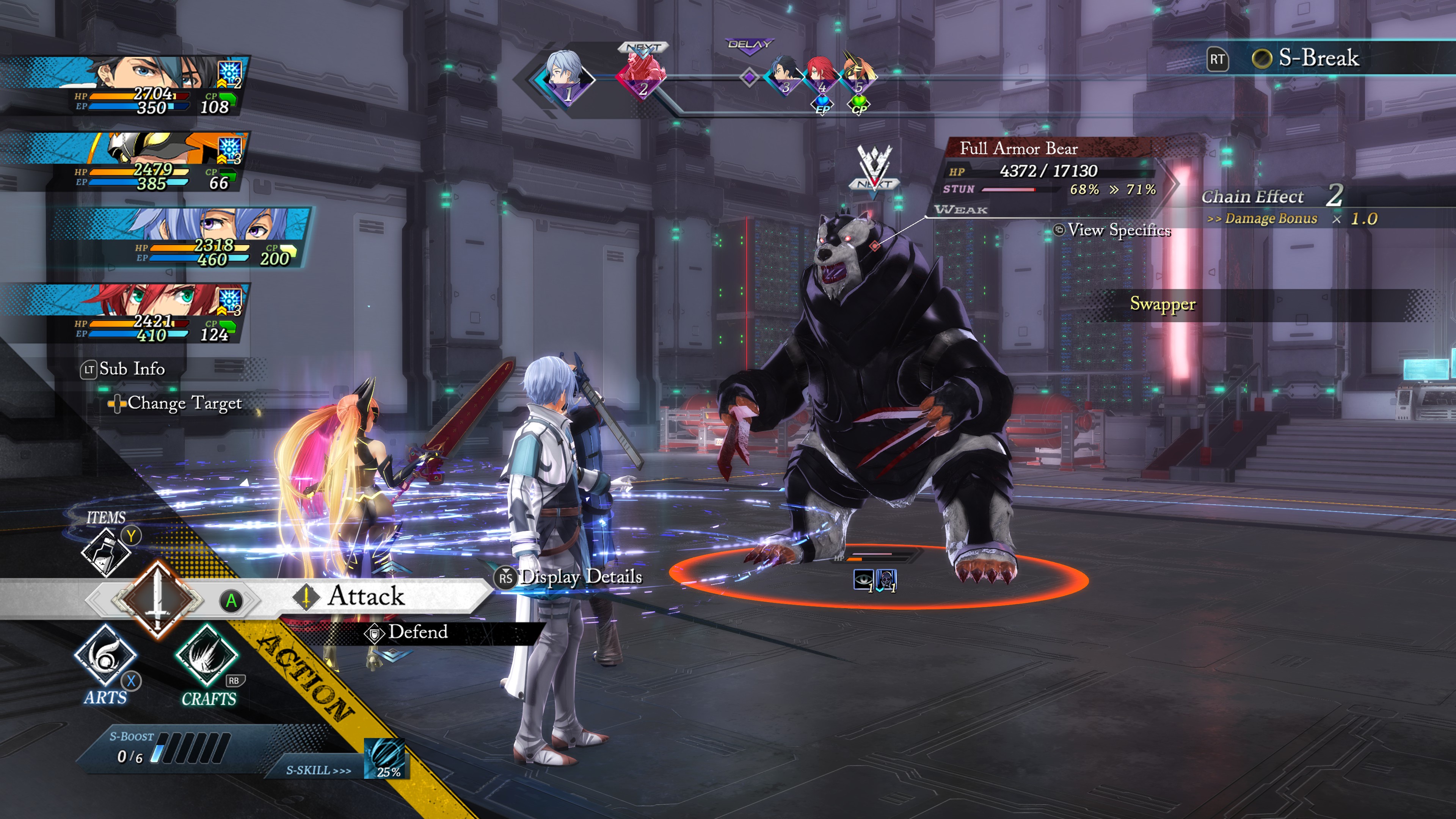
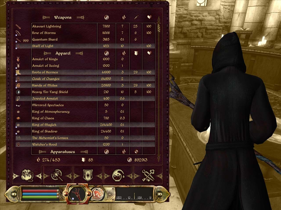
I like visual aesthetics of the combat UI in the later Final Fantasy games (10 onwards, 13, 14, etc), with the blue text and general futuristic sci fi vibe. (See the party UI on the upper left side of this screenshot):

The menus in Granblue Fantasy Relink looked picturesque.

The weapon upgrade screen in the Final Fantasy Remake with the galaxy in the background and the waving auroras and sci fi hexagons was cool.

Guild Wars 2: I liked how when clicking on certain buttons in menus, there was a painterly transition. EDIT: took a recording but couldn't find the exact menu I was thinking of, maybe it was removed from the game.

Star Citizen: it was neat how you would raise up your arm and activate your wrist mounted menu screen (the MOBIGLASS) to look at your inventory, check the status of your ship, check the prices of an item, etc. Other players could see that you looking at your MOBIGLASS, but I don't think they could see what exact holographic screen you were looking at.
I thought it was neat how there were models and doodads on the boards in Hearthstone that you could click on and cause things to happen while waiting for the enemy to take their turn.
I thought it was neat how in KCD, there was a point in the story where you travelled with a group of soldiers, and then it switched to the painterly world map showing you and a bunch of other chess pieces moving along a road.
Path of Exile had a "whoa" factor when you opened up the skill tree and scrolled out and saw hundreds of nodes and all of these complicated connections, which at first glance made you think that it must be a very indepth, hugely customizeable RPG. But then after a while you realize that - like the FF10 Sphere Grid it imitates - the vast majority of the nodes are passive +2 STR bonuses, and only a small handful of nodes actually matter, and pathing to them isn't a struggle. You use out of game calculators to figure that out for you, and the most optimal node combinations have been solved.
I don't have footage of it saved, but Blizzard did something really cool with the aritfact weapon menu in the WoW Legion expansion. Throughout the expansion, killing mobs and doing quests would infuse your artifact weapon with magical power, slowly raising your artifact power stat on the artifact weapon UI. In the final patch, you went to the humongous Sword of Sargeras and sacrificed your weapon to save the world, drawing dark energy out of the sword into your weapon. You would open up your artifact weapon screen, and the menu would be shaking and lit up and there was an effect showing tremendous amounts of power flowing into your weapon while your artifact power stat was in the quadrillions and rising every second. I am sure it had to have been a client side cosmetic effect, no way the Blizzard servers would be constantly updating numbers that big and sending them over the internet every second. And then the 8.0 prepatch hit and your artifact weapon finally exploded and broke and you threw it into the bank and forgot about it. There was popular meme back then that our artifact weapons blew up Teldrassil (this was we suspected but did not have hard confirmation that Sylvanas would destroy the tree, so there was some speculation out there as to whether or not it was an Alliance false flag or old gods or an accident).

I also thought it was cool how the SCLM radius in Daybreak was represented by in universe holographic rings.
I like visual aesthetics of the combat UI in the later Final Fantasy games (10 onwards, 13, 14, etc), with the blue text and general futuristic sci fi vibe. (See the party UI on the upper left side of this screenshot):
The menus in Granblue Fantasy Relink looked picturesque.
The weapon upgrade screen in the Final Fantasy Remake with the galaxy in the background and the waving auroras and sci fi hexagons was cool.
Guild Wars 2: I liked how when clicking on certain buttons in menus, there was a painterly transition. EDIT: took a recording but couldn't find the exact menu I was thinking of, maybe it was removed from the game.
Star Citizen: it was neat how you would raise up your arm and activate your wrist mounted menu screen (the MOBIGLASS) to look at your inventory, check the status of your ship, check the prices of an item, etc. Other players could see that you looking at your MOBIGLASS, but I don't think they could see what exact holographic screen you were looking at.
I thought it was neat how there were models and doodads on the boards in Hearthstone that you could click on and cause things to happen while waiting for the enemy to take their turn.
I thought it was neat how in KCD, there was a point in the story where you travelled with a group of soldiers, and then it switched to the painterly world map showing you and a bunch of other chess pieces moving along a road.
Path of Exile had a "whoa" factor when you opened up the skill tree and scrolled out and saw hundreds of nodes and all of these complicated connections, which at first glance made you think that it must be a very indepth, hugely customizeable RPG. But then after a while you realize that - like the FF10 Sphere Grid it imitates - the vast majority of the nodes are passive +2 STR bonuses, and only a small handful of nodes actually matter, and pathing to them isn't a struggle. You use out of game calculators to figure that out for you, and the most optimal node combinations have been solved.
I don't have footage of it saved, but Blizzard did something really cool with the aritfact weapon menu in the WoW Legion expansion. Throughout the expansion, killing mobs and doing quests would infuse your artifact weapon with magical power, slowly raising your artifact power stat on the artifact weapon UI. In the final patch, you went to the humongous Sword of Sargeras and sacrificed your weapon to save the world, drawing dark energy out of the sword into your weapon. You would open up your artifact weapon screen, and the menu would be shaking and lit up and there was an effect showing tremendous amounts of power flowing into your weapon while your artifact power stat was in the quadrillions and rising every second. I am sure it had to have been a client side cosmetic effect, no way the Blizzard servers would be constantly updating numbers that big and sending them over the internet every second. And then the 8.0 prepatch hit and your artifact weapon finally exploded and broke and you threw it into the bank and forgot about it. There was popular meme back then that our artifact weapons blew up Teldrassil (this was we suspected but did not have hard confirmation that Sylvanas would destroy the tree, so there was some speculation out there as to whether or not it was an Alliance false flag or old gods or an accident).
Last edited by Val the Moofia Boss on March 29th, 2025, 03:18, edited 6 times in total.
-
Tweed

- Turtle
- Posts: 6837
- Joined: Feb 2, '23
-
Geolocation
Adventurer's Guild
Visually, it was a major improvement, but performance-wise it was a nightmare. As I've told people many times before, they have polished memories of Ultima VII without the twenty second delay to open the inventory and then trying to click and drag and object only for the game to tell you that you can't reach it. The GUMP inventory probably sounded realistic and immersive on paper, but trying to keep it sorted it is a mess. Now, imagine having to do this for a full part of people on an average computer of the time. Seprent Isle did make management slightly easier with the paperdoll and bag slot though.
-
Valter

- Posts: 1739
- Joined: Jun 12, '24
-
Geolocation
Adventurer's Guild
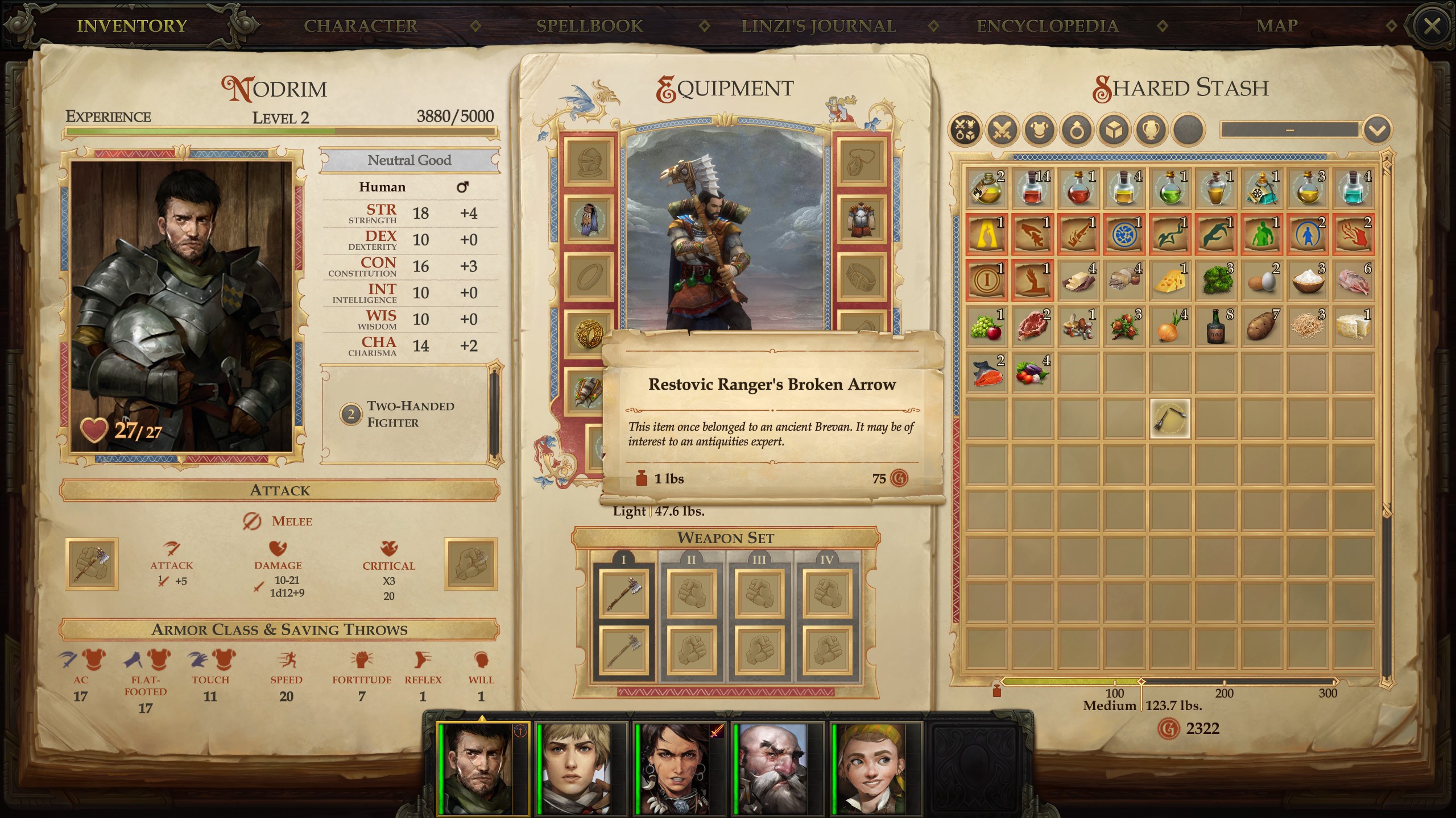
Pathfinder Kingmaker (and WoTR) UI was just so quaint and a delight on the eyes. The font, the little worn-out pages, just lovely. And beginner-friendly too, as you'd usually get a full explanation of whatever stat or term you'd hover over
Steam friend code: 1525876263
-
Oyster Sauce
- Site Moderator
- Posts: 11293
- Joined: Jun 2, '23
-
Geolocation
Adventurer's Guild
-
Tweed
- Turtle
- Posts: 6837
- Joined: Feb 2, '23
-
Geolocation
Adventurer's Guild
Ironically, Ultima went from text lists to icon grids then the messy gump management and that stuck around for three games (U7, SI, and Pagan).rusty_shackleford wrote: ↑ March 29th, 2025, 02:20As much as I understand what they were going for with Ultima VII's diegetic bag interfaces, it's just too much. I don't know if anyone ever actually liked it, it was also used in UO, maybe Ultima 8? Never played it.A more granular grid-based inventory would be fine for when dealing with volume, IMO. Add in the ability to rotate items on top of it.
Larian somewhat copied the bag UI from Ultima VII(like many features in Larian games), but they just use icon-based inventories, which I dislike.
-
asf
- Turtle
- Posts: 3176
- Joined: Feb 2, '23
- Gender: Helicopter
-
Geolocation
-
MrTwinkls

- Posts: 645
- Joined: Mar 12, '24
-
Geolocation
No favorites. I like mouse oriented UIs where everything is located clearly on one page with minimum amount of tabs. Basically web 1.0 style. Consoles killed UIs for me.
► Show Spoiler
-
traxtan
- Posts: 796
- Joined: Jan 1, '25
-
Geolocation
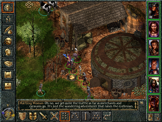
Kingdom Come Deliverance, easy to parse, read and navigate.
You do not have the required permissions to view the files attached to this post.
-
TKVNC

- Posts: 3081
- Joined: Feb 25, '24
-
Geolocation
Adventurer's Guild
I liked Morrowind's UI
It was also a PC oriented UI which means it gets a bonus for not being console slop.
Warband has a nice UI too, but there are a few things that are quite annoying not being able to move entire lists of troops at once for instance.
It was also a PC oriented UI which means it gets a bonus for not being console slop.
Warband has a nice UI too, but there are a few things that are quite annoying not being able to move entire lists of troops at once for instance.
My Mods:
Kenshi:
viewtopic.php?t=3219-under-armour-edits-1-0-kenshi - Under Armour Edits
viewtopic.php?f=26&t=3262-face-expansion-1-0-kenshi - Face Expansion
Kenshi:
viewtopic.php?t=3219-under-armour-edits-1-0-kenshi - Under Armour Edits
viewtopic.php?f=26&t=3262-face-expansion-1-0-kenshi - Face Expansion
-
Oyster Sauce
- Site Moderator
- Posts: 11293
- Joined: Jun 2, '23
-
Geolocation
Adventurer's Guild
ElvUI > Morrowind > good soulful UIs > good UIs > bad soulful UIs > bad UIs
-
Ryzer

- Posts: 174
- Joined: Sep 5, '23
-
Geolocation
Adventurer's Guild
I absolutely love BG1 UI, it absolutely wins in esthetics.


Early UI design looked better for me
Early UI design looked better for me
Last edited by Ryzer on March 29th, 2025, 13:44, edited 1 time in total.
-
TKVNC
- Posts: 3081
- Joined: Feb 25, '24
-
Geolocation
Adventurer's Guild
It's good, but there's not quite enough contrast between the background and some of the elements.Ryzer wrote: ↑ March 29th, 2025, 13:39I absolutely love BG1 UI, it absolutely wins in esthetics.
Early UI design looked better for me
Mild shadowing to the edge of the letters would probably fix that though.
My Mods:
Kenshi:
viewtopic.php?t=3219-under-armour-edits-1-0-kenshi - Under Armour Edits
viewtopic.php?f=26&t=3262-face-expansion-1-0-kenshi - Face Expansion
Kenshi:
viewtopic.php?t=3219-under-armour-edits-1-0-kenshi - Under Armour Edits
viewtopic.php?f=26&t=3262-face-expansion-1-0-kenshi - Face Expansion
-
asf
- Turtle
- Posts: 3176
- Joined: Feb 2, '23
- Gender: Helicopter
-
Geolocation
-
Dorateen

- Turtle
- Posts: 199
- Joined: Sep 29, '23
-
Geolocation
Adventurer's Guild
I've always liked the character sheet/inventory screen from Crusaders of the Dark Savant.
-
Demonic Fate

- Posts: 694
- Joined: Feb 19, '25
-
Geolocation
Adventurer's Guild
Darnified UI was so good. It even had "dark mode" before that was a thing, I think this was the same theme I used:Vergil wrote: ↑ March 29th, 2025, 02:17Todd Howard said the only mods he used for Oblivion on PC was a UI mod. They have no excuse for this **** after that.rusty_shackleford wrote: ↑ March 29th, 2025, 02:15Not directly related to style, but Bethesda managing to make their UI functionally worse with every new game is impressive when they have clear examples of how to improve it in the form of mods.Vergil wrote: ↑ March 29th, 2025, 02:13Oblivion's UI had functionality issues but it certainly had no issues when it came to be absolutely gorgeous. I despise the ****** *** minimalism of Skyrim.
SkyUI is essentially Oblivion's inventory except extended.
Some guy made a vastly improved starfield UI mod while the game was still in head-start
-
Vergil
- Posts: 15670
- Joined: Sep 6, '23
-
Geolocation
It's always been meh for me. Didn't like the visual changes.Demonic Fate wrote: ↑ March 29th, 2025, 14:48Darnified UI was so good. It even had "dark mode" before that was a thing, I think this was the same theme I used:Vergil wrote: ↑ March 29th, 2025, 02:17Todd Howard said the only mods he used for Oblivion on PC was a UI mod. They have no excuse for this **** after that.rusty_shackleford wrote: ↑ March 29th, 2025, 02:15
Not directly related to style, but Bethesda managing to make their UI functionally worse with every new game is impressive when they have clear examples of how to improve it in the form of mods.
SkyUI is essentially Oblivion's inventory except extended.
Some guy made a vastly improved starfield UI mod while the game was still in head-start
I'm just stating the facts.
Question is are you going to gargle the truth or swallow?
Question is are you going to gargle the truth or swallow?
-
rustys-name-is-kumar

- Posts: 128
- Joined: Feb 22, '25
-
Geolocation
ultima always had really ugly games in just about all facets including ui, "lord british" is a mark for putting himself in his own universe so ultimas lameness goes up even higher. **** games.
-
Kalarion

- Turtle
- Posts: 2163
- Joined: Feb 2, '23
-
Geolocation
Adventurer's Guild
I like good skeuomorphic uis. The best in recent memory that I can think of is Highfleet's:


-
Vergil
- Posts: 15670
- Joined: Sep 6, '23
-
Geolocation
I didn't mind the UI in the KOTOR games even if they're very console-ified. I liked the gimmick of each game having it's own color. I wonder what KOTOR III's UI would have looked like. There's a KOTOR III mod that's been in development hell for almost 15 years that chose red which looked a bit garish.
I'm just stating the facts.
Question is are you going to gargle the truth or swallow?
Question is are you going to gargle the truth or swallow?
-
LMR843

- Posts: 13
- Joined: Feb 2, '24
-
Geolocation
System Shock 1 and 2


Last edited by LMR843 on May 15th, 2025, 20:07, edited 1 time in total.
-
Val the Moofia Boss
- Turtle
- Posts: 4198
- Joined: Jun 3, '23
-
Geolocation
Adventurer's Guild
I liked the floral backdrops behind the menus in Sakura Wars 1 and 2. The backdrop changes depending on whether it is day or night, and changes with each chapter. I cannot recall if these backdrops were reused from SW1, or if they are brand new. I lost my SW1 screenshot folder  .
.
► Show Spoiler


-
maidenhaver

- Posts: 9452
- Joined: Apr 17, '23
- Location: ROLE PLAYING GAME
-
Geolocation
Adventurer's Guild
-
Norfleet
- Posts: 2762
- Joined: Jun 3, '23
-
Geolocation
-
Kalarion
- Turtle
- Posts: 2163
- Joined: Feb 2, '23
-
Geolocation
Adventurer's Guild
Is this some kind of FF MUD? It looks great, what is it?