I remember going to a Walmart and walking down the games aisle when the
World of Warcraft boxes caught my eyes. I remember picking them off the shelf, feeling the raised textures of the hard cardboard under my thumbs, unfolding the panels to look at Wei Wang's illustrations inside. I really did make you look like you holding a premium product compared to the relatively cheaper plastic boxes on the shelves.
Mists of Pandaria has the best box cover, while
Wrath of the Lich King has the best inside panels.


The
Final Fantasy XI: Treasures of Aht Urghan cover by Yoshitaka Amano, where you are looking through a frame at the titular near eastern city.

This and the base game were the two PS2 boxes I had for FF11. Sadly I bought this box off of ebay and the codes were already used up

. The dark blue sepia filter is interesting.

The
Final Fantasy XIV: Stormblood collector's edition box art by Yoshitaka Amano, depicting Lyse in the afternoon sun overlooking her ancestral home of Ala Mhigo which is under occupation by the empire. It has that grandiose but kinda sad vibe.

Japanese Stormblood cover by Akihiko Yoshida with the main cast of characters. Gosetsu's face looks much more fierce here than in the game.

The
Final Fantasy XIV: Shadowbringers collector's edition box art by Yoshitaka Amano. He looks really fierce.
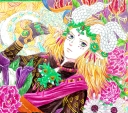
 Suikoden V
 cover by Kaori Fujita. Sialeeds jumping/falling adds some motion.

The cover of the first
Xenoblade Chronicles for Wii. The setting of the game is that it takes place on these huge titans, and you crawl up their knees and thighs and their backs and through their lungs and on top of their shoulders and their giant swords. Novel. Also you have the promise of finality with the protagonist's sword left in the field.
 Utawarerumono: Mask of Truth
 cover by Tatsuki Amazuyu. MoT is a direct sequel/continuation/conclusion/part 2 to its predecessor game/part 1, Mask of Deception. The ending of MoD really made me excited for MoT and wonder "how is he going to pull this off now?", and then you have the drama of his divided loyalties between the two opposing empresses.
 Final Fantasy Tactics
. Five knights riding off on their mission. I like the dream like quality of the white, desaturated background.

The cover of
Fire Emblem: Awakening by Yuusuke Kozaki. The diagonal lines direct the eye, the characters look fierce, and you have the mystique of the masked character being a contrarian and flying in the other direction while wielding a duplicate of Chrom's sword.

I got the special (or limited? Not the collectors stuff) edition of Fire Emblem Fates, where you got all three campaigns + some of the DLC content on one cartridge, and this is the cover I got. I like the early morning background, and the colorful white and red aesthetic of Hoshido.
 Tactics Ogre
 cover by Akihiko Yoshida. I like the heraldic flag waving in the back. The "this is our first game, but it is actually episode #6 in this huge saga!" thing that the Japanese RPG devs (or marketers?) like to do with Xenogears and such at the time is pretty funny. Maybe they got the idea from George Lucas after he finished the OT and did a bunch of interviews in preparation for the Prequel trilogy.

The
Berwick Saga cover. Looks like a small band of hardened brothers out to avenge and tracking their prey. Again with the funny "chapter ### of ###" blurb.

I know it has become popular to be a contrarian against
Shadow of the Colossus due to the now hated games journalists who touted it and Last of Us as their example of "games can be art too!" as a rebuttal to Roger Ebert, but I quite liked this game and must have played it three or four times. I don't think it is the bestest thing ever, but I quite liked the art direction, the atmosphere of riding across this empty, sad ruined wasteland, and the grim and bittersweet of story.

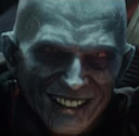
One of the few American covers of a JRPG that is better than the original Japanese, this time depicting the big bad (who was supposed to have a playable route which was cut during development. The original cover was also a 3D model but of the much less cool looking Rush staring at the viewer. Should have been a 2D illustration and played to the Japanese's strength of a more emotive image.

(Couldn't quickly find the English version of this cover off of Google). I remember getting the Creature Creator (this game pictured below) which was a teaser for the full spore game. The cover hooked my attention with the variety of creatures it promised you could create. I remember being a little frustrated by the game, because I couldn't paint/texture my creatures like what you see on the cover with all of the small bumps and scales and other details.

The cover of the main Spore game. I quite liked the small blue creature with the fur, and again was a little frustrated I couldn't really replicate that fur look ingame. I guess the models used for these covers were not taken directly from the ingame creature creator, but might have been modelled or textured out of game like with Maya or Zbrush and Adobe Photoshop, and maybe a lighting engine more advanced than the ingame was used.