
We have a Steam curator now. You should be following it. https://store.steampowered.com/curator/44994899-RPGHQ/

Badges
-
rusty_shackleford

- Site Admin
- Posts: 45459
- Joined: Feb 2, '23
- Gender: Watermelon
-
Geolocation
Adventurer's Guild
This is the official AP save file icon on consoles fwiw

Thank you for your attention to this matter!
Steam friend code: 40552640 https://steamcommunity.com/friends/add | email: [email protected]
Having trouble running an old Windows game?
Rusty's Stuff Collection
Steam friend code: 40552640 https://steamcommunity.com/friends/add | email: [email protected]
Having trouble running an old Windows game?
Rusty's Stuff Collection
-
rusty_shackleford
- Site Admin
- Posts: 45459
- Joined: Feb 2, '23
- Gender: Watermelon
-
Geolocation
Adventurer's Guild
J1M wrote: ↑ December 16th, 2024, 22:23I think what you did with an accent color to make the image 'bubble up' looks nice. Somewhat the opposite of what I was going for which is an appearance of the content being set in a thin metal ridge, but it looks nice.
I'm not a professional artist or using anything more sophisticated than Paint.NET. I just wanted the forum to look less shabby so I volunteered to help.
rusty_shackleford wrote: ↑ December 16th, 2024, 17:33(unrelated to the nitpick stuff)
I think the badges look neat.
Thank you for your attention to this matter!
Steam friend code: 40552640 https://steamcommunity.com/friends/add | email: [email protected]
Having trouble running an old Windows game?
Rusty's Stuff Collection
Steam friend code: 40552640 https://steamcommunity.com/friends/add | email: [email protected]
Having trouble running an old Windows game?
Rusty's Stuff Collection
-
rusty_shackleford
- Site Admin
- Posts: 45459
- Joined: Feb 2, '23
- Gender: Watermelon
-
Geolocation
Adventurer's Guild
Thank you for your attention to this matter!
Steam friend code: 40552640 https://steamcommunity.com/friends/add | email: [email protected]
Having trouble running an old Windows game?
Rusty's Stuff Collection
Steam friend code: 40552640 https://steamcommunity.com/friends/add | email: [email protected]
Having trouble running an old Windows game?
Rusty's Stuff Collection
-
Stack of Turtles

- Posts: 7041
- Joined: May 7, '24
- Location: Soon-to-be Iran
-
Geolocation
These are excellent, I love the spatial definition of them with the gradients. It really makes them look like physical objects. One thing I would suggest, though, is a touch of gradient on the backgrounds so they don't look quite as flat and plastic. That nice shine on the border should be carried through in the center, I think.Silver wrote: ↑ December 16th, 2024, 21:36@J1M, I appreciate greatly how calm and non-offended you are even after me bugging you about badges for some time now. It's very refreshing (for me) to encounter a person who doesn't take criticism as a personal offense and a threat lol.
Bloodlines badge can be uneven I suppose. Trauma inducing asymmetry, but at least it has "backstory" to it.
I agree that the look should be visually distinct overall, but it doesn't mean it has to be sloppy while achieving it. Frame can be even. Shadows can be even. And the distinct PIN look is still there.
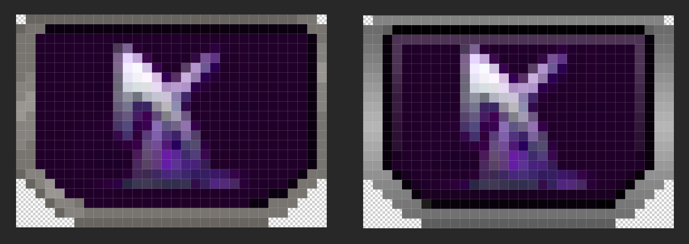
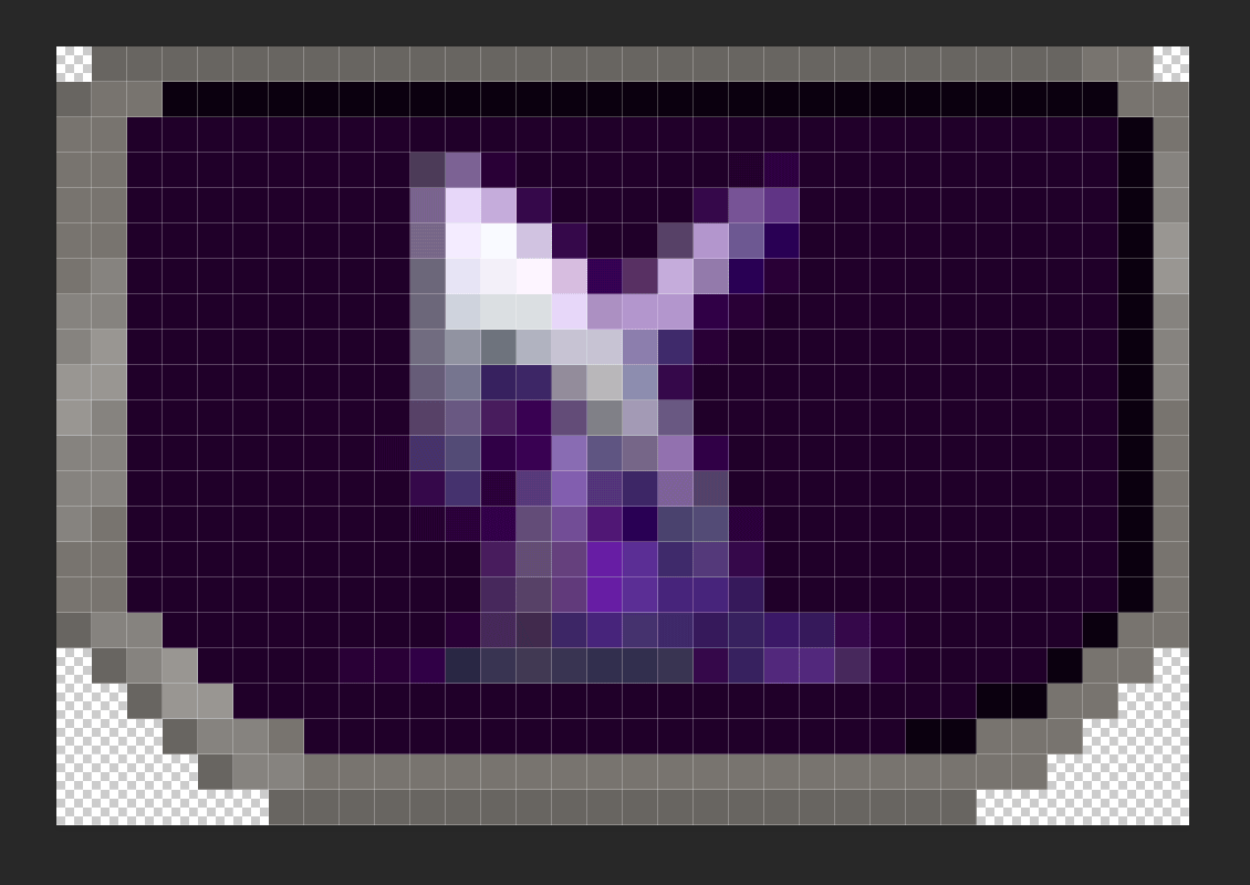
Here's a 3200% zoom (to see every pixel) on original pin and my edit, that was done on top to battle frame thickness being uneven and discolouration of said frame, that inevitably leads to muddiness when the image is of that tiny size. I kept all sides a pixel thicker except top one, brings out the 3d'ness of the badge the best:And here are the original badge and an edit side by side in 32 px size:► Show Spoiler

And here are some of edited badges together in 32 px size (I had old shard of spring pin on my PC, that's why I used it):


Original in same order:


While I still think 32 px width is a crime against human's eyes, there is more uniform definition to badges because literal pixels are so sharp and apart from each other. I added transparent inner black shadow, so that silver frame pops up more against light backgrounds instead of blending in (redemption, dao pins), but there's also 1 px worth of light and dark gradient that makes darker backgrounds stand out as well (deus ex, shard of spring pins).
It really ain't much, but the sharp clarity of said pixels brings a lot of uniformity to such small icons.
Here's a side by side size comparison of 32, 36 and 40 px badges accordingly. I think I missed the shadow on 40 px version, but it's more so to showcase size difference really.


Just a random gif I made, 40 px as well:
Badges of all sizes and shapes matter, of course, but I rrrreally really recommend at least 36 px. No one is taxing pixel real estate here on the profile, why don't just use it.
But then again, size is really not what's bothering me here at this point, it's more the inconsistency of it all.
As I said before, I actually got no clue what software is used for badges, maybe I blindly missed it. But here's a template / edit I made in PSD. So anyone can tweak with it and take / remove whichever changes they like.
► All three PSD pin sizes
I really hope my explanations and visualisations helped with something at least. I'm not out here trying to redesign anything that you, J1M, already made. I just wish it to look it's best self.


VAE VICTIS
-
Stack of Turtles
- Posts: 7041
- Joined: May 7, '24
- Location: Soon-to-be Iran
-
Geolocation
I think the slight pop on the inside of the badges is actually necessary to make them look inset and not just like plastic pieces. When you have fabric pressed in a metal frame like a pin, it bulges out slightly in the middle.rusty_shackleford wrote: ↑ December 16th, 2024, 22:34I agree with @J1M re: inset badges, but the border itself is an improvement @Silver
VAE VICTIS
-
Silver

- Posts: 471
- Joined: Dec 4, '23
-
Geolocation
@Stack of Turtles Let me try 2 shines on the badges. I can add those to the template as well.
Paint.NET should support PSD files just fine, and inside of the file there's a background allowance already, so you can just clip any background through mask on it and call it good.
I guess graphic designer background and a longtime forum user / admin, gives me a bit of a trained eye lol.
Paint.NET should support PSD files just fine, and inside of the file there's a background allowance already, so you can just clip any background through mask on it and call it good.
I guess graphic designer background and a longtime forum user / admin, gives me a bit of a trained eye lol.

-
Stack of Turtles
- Posts: 7041
- Joined: May 7, '24
- Location: Soon-to-be Iran
-
Geolocation
I would make the shine on the badge content a little duller than on the frame, though. I think it should look like fabric, not metal. I guess they could be enamel pins, but I like to picture them as embroidery.
Last edited by Stack of Turtles on December 16th, 2024, 22:55, edited 1 time in total.
VAE VICTIS
-
Silver
- Posts: 471
- Joined: Dec 4, '23
-
Geolocation
@Stack of Turtles @J1M
I got 2 shines here.
1st one is a middle diffused shine, very mild. You won't really see it on badges that are of brighter background, unless shine gets more opaque.


2nd one is a top "bubble" shine, rounded and has a sharper edge.


I got 2 shines here.
1st one is a middle diffused shine, very mild. You won't really see it on badges that are of brighter background, unless shine gets more opaque.
2nd one is a top "bubble" shine, rounded and has a sharper edge.
-
Stack of Turtles
- Posts: 7041
- Joined: May 7, '24
- Location: Soon-to-be Iran
-
Geolocation
I personally prefer the first one. It doesn't need to show strongly on lighter colors as long as there's enough of a hint to it to imply lighting consistently, which based on the vtmr pin I'd say there is.Silver wrote: ↑ December 16th, 2024, 23:03@Stack of Turtles @J1M
I got 2 shines here.
1st one is a middle diffused shine, very mild. You won't really see it on badges that are of brighter background, unless shine gets more opaque.
2nd one is a top "bubble" shine, rounded and has a sharper edge.
The "bubble" shine is also nice but gives them a different implied 3d geometry than what I like to imagine.
VAE VICTIS
-
rusty_shackleford
- Site Admin
- Posts: 45459
- Joined: Feb 2, '23
- Gender: Watermelon
-
Geolocation
Adventurer's Guild

Thank you for your attention to this matter!
Steam friend code: 40552640 https://steamcommunity.com/friends/add | email: [email protected]
Having trouble running an old Windows game?
Rusty's Stuff Collection
Steam friend code: 40552640 https://steamcommunity.com/friends/add | email: [email protected]
Having trouble running an old Windows game?
Rusty's Stuff Collection
-
Silver
- Posts: 471
- Joined: Dec 4, '23
-
Geolocation
This looks cool though? Imorusty_shackleford wrote: ↑ December 16th, 2024, 22:29This is the official AP save file icon on consoles fwiw


► Saw an interesting pixel ankh and wanted to try it too

Updated PSD for 32 px badge with shine.
Last edited by Silver on December 16th, 2024, 23:34, edited 1 time in total.
-
rusty_shackleford
- Site Admin
- Posts: 45459
- Joined: Feb 2, '23
- Gender: Watermelon
-
Geolocation
Adventurer's Guild

Thank you for your attention to this matter!
Steam friend code: 40552640 https://steamcommunity.com/friends/add | email: [email protected]
Having trouble running an old Windows game?
Rusty's Stuff Collection
Steam friend code: 40552640 https://steamcommunity.com/friends/add | email: [email protected]
Having trouble running an old Windows game?
Rusty's Stuff Collection

-
J1M

- Turtle

- Posts: 5068
- Joined: Feb 15, '23
-
Geolocation
Adventurer's Guild
I don't like the save icon because his shoulder looks like a gun he's pointing at himself. The Alpha Protocol seal is too busy and has awful color choices, but I think we could do an alpha glyph on top of three arrows inspired by the seal to thread the needle of all the feedback. It needs targeted editing and recolors to be legible though.
-
J1M
- Turtle
- Posts: 5068
- Joined: Feb 15, '23
-
Geolocation
Adventurer's Guild
I prefer the first one, but I would remove the enamel frame because although it is a cool technique I don't think it is right for these metal pins.Silver wrote: ↑ December 16th, 2024, 23:03@Stack of Turtles @J1M
I got 2 shines here.
1st one is a middle diffused shine, very mild. You won't really see it on badges that are of brighter background, unless shine gets more opaque.
2nd one is a top "bubble" shine, rounded and has a sharper edge.
-
Silver
- Posts: 471
- Joined: Dec 4, '23
-
Geolocation
Sure thing. I'll try tweaking it a bit later in the evening.J1M wrote: ↑ December 17th, 2024, 00:08@Silver want to take a shot at iteration on the two-tone background used to differentiate the OG AG?
Last edited by Silver on December 17th, 2024, 01:03, edited 1 time in total.
-
Oyster Sauce

- Site Moderator
- Posts: 11291
- Joined: Jun 2, '23
-
Geolocation
Adventurer's Guild


-
Silver
- Posts: 471
- Joined: Dec 4, '23
-
Geolocation
Honestly, I don't have much feedback on the two-tone badges overall. @J1M
The only two things I'd keep an eye on are:
1. Keeping both colours at similar / close level of brightness will help pin not look divided by the contrast or too overwhelming for the eye.
Overall darker background for a light logo on top and a lighter background for dark logo.
 ///
/// 
2. Adding just a little gradient to background helps it to not look flat as well.

That would be all, really. There's nothing wrong with split colours, just gotta keep it cohesive and make sure that logo stands out first and foremost, not the background.
Also, I don't know if people really want just "a" back for alpha protocol, but the arrows badge is alright. "a" just needed more shadow to not blend with the rest of it.
Or maybe altogether a different colour.

The only two things I'd keep an eye on are:
1. Keeping both colours at similar / close level of brightness will help pin not look divided by the contrast or too overwhelming for the eye.
Overall darker background for a light logo on top and a lighter background for dark logo.
/// 2. Adding just a little gradient to background helps it to not look flat as well.
That would be all, really. There's nothing wrong with split colours, just gotta keep it cohesive and make sure that logo stands out first and foremost, not the background.
Also, I don't know if people really want just "a" back for alpha protocol, but the arrows badge is alright. "a" just needed more shadow to not blend with the rest of it.
Or maybe altogether a different colour.
Last edited by Silver on December 17th, 2024, 02:57, edited 2 times in total.
-
logincrash

- The Music Man
- Posts: 6040
- Joined: Sep 3, '23
- Location: Niger
-
Geolocation
Adventurer's Guild
The first one is still the best, I think. The gold alpha stands out a lot more and it's quite bigger. It would work fine with the new frames.
The white one is alright, I guess.
I don't know what happened here, but I literally cannot tell that there are supposed to be arrows in the background. In J1M's version I see the arrowheads and the shafts, but here there are only squiggly lines.
This is my 1488th post
Last edited by logincrash on December 17th, 2024, 10:34, edited 1 time in total.
"Oh, it all makes sense now, brother."
-
rusty_shackleford
- Site Admin
- Posts: 45459
- Joined: Feb 2, '23
- Gender: Watermelon
-
Geolocation
Adventurer's Guild
I think @Silver may be downscaling the badges with linear interpolation?
Thank you for your attention to this matter!
Steam friend code: 40552640 https://steamcommunity.com/friends/add | email: [email protected]
Having trouble running an old Windows game?
Rusty's Stuff Collection
Steam friend code: 40552640 https://steamcommunity.com/friends/add | email: [email protected]
Having trouble running an old Windows game?
Rusty's Stuff Collection
-
Stack of Turtles
- Posts: 7041
- Joined: May 7, '24
- Location: Soon-to-be Iran
-
Geolocation
No, a glow was added around the alpha to make it stand out, which obscures most of the background.rusty_shackleford wrote: ↑ December 17th, 2024, 03:31I think @Silver may be downscaling the badges with linear interpolation?
The background didn't really have any clarity to me in either iteration but I'm not familiar with the game so I wouldn't know what it's meant to be anyway.
ETA: In fact (having zoomed in a lot to see what they were), I would recommend, instead of the halo of arrows pointing out that mostly get cut off and don't antialias well because none of them are straight lines and the resolution is too small, maybe two or four arrows lineally arranged around the alpha, either to the sides, above, or both, would be better, assuming the arrows are in fact recognizable symbols.
Last edited by Stack of Turtles on December 17th, 2024, 03:36, edited 1 time in total.
VAE VICTIS
-
J1M
- Turtle
- Posts: 5068
- Joined: Feb 15, '23
-
Geolocation
Adventurer's Guild
logincrash wrote: ↑ December 17th, 2024, 03:20The first one is still the best, I think. The gold alpha stands out a lot more and it's quite bigger. It would work fine with the new frames.
The white one is alright, I guess.I don't know what happened here, but I literally cannot tell that there are supposed to be arrows in the background. In J1M's version I see the arrowheads and the shafts, but here there are only squiggly lines.
It's literally the difference of 2 extra pixels of vertical information. This is what I was referencing above as a concern regarding the shiny frame. I really like the specular highlights on the sides, but using more than 3 pixels combined for the top and bottom frame caused me to run into this problem.rusty_shackleford wrote: ↑ December 17th, 2024, 03:31I think @Silver may be downscaling the badges with linear interpolation?
Last edited by J1M on December 17th, 2024, 04:22, edited 1 time in total.
-
J1M
- Turtle
- Posts: 5068
- Joined: Feb 15, '23
-
Geolocation
Adventurer's Guild
Yeah, I just cropped a recolored version of the seal for the agency to communicate the idea. I think the ideal solution would be to redraw just 3 arrows and alpha glyph to eliminate the visual noise.Stack of Turtles wrote: ↑ December 17th, 2024, 03:33No, a glow was added around the alpha to make it stand out, which obscures most of the background.rusty_shackleford wrote: ↑ December 17th, 2024, 03:31I think @Silver may be downscaling the badges with linear interpolation?
The background didn't really have any clarity to me in either iteration but I'm not familiar with the game so I wouldn't know what it's meant to be anyway.
ETA: In fact (having zoomed in a lot to see what they were), I would recommend, instead of the halo of arrows pointing out that mostly get cut off and don't antialias well because none of them are straight lines and the resolution is too small, maybe two or four arrows lineally arranged around the alpha, either to the sides, above, or both, would be better, assuming the arrows are in fact recognizable symbols.
Last edited by J1M on December 17th, 2024, 04:21, edited 1 time in total.
-
rusty_shackleford
- Site Admin
- Posts: 45459
- Joined: Feb 2, '23
- Gender: Watermelon
-
Geolocation
Adventurer's Guild
?

Thank you for your attention to this matter!
Steam friend code: 40552640 https://steamcommunity.com/friends/add | email: [email protected]
Having trouble running an old Windows game?
Rusty's Stuff Collection
Steam friend code: 40552640 https://steamcommunity.com/friends/add | email: [email protected]
Having trouble running an old Windows game?
Rusty's Stuff Collection
-
Silver
- Posts: 471
- Joined: Dec 4, '23
-
Geolocation
Oh, no. I just downloaded J1M's version and just layered it on top. so that's probably why quality suffers.rusty_shackleford wrote: ↑ December 17th, 2024, 03:31I think @Silver may be downscaling the badges with linear interpolation?