We have a Steam curator now. You should be following it. https://store.steampowered.com/curator/44994899-RPGHQ/

Badges
-
Lich
- Turtle

- Posts: 2688
- Joined: Feb 6, '23
-
Geolocation
It's a grognard thing. You wouldn't get it.Silver wrote: ↑ December 9th, 2024, 18:09Why there's such an accent being made about keeping everything brown?
-
WhiteShark

- Site Moderator
- Posts: 5056
- Joined: Feb 2, '23
-
Geolocation
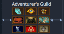
Adventurer's Guild
@J1M volunteered to be the badge guy, and he modeled them after Boy Scouts badges.Silver wrote: ↑ December 9th, 2024, 18:09I'm not part of AG and I have a genuine question. Why there's such an accent being made about keeping everything brown?
-
Vergil
- Posts: 15670
- Joined: Sep 6, '23
-
Geolocation
Well, I guess you get what you don't pay for
I'm just stating the facts.
Question is are you going to gargle the truth or swallow?
Question is are you going to gargle the truth or swallow?
-
J1M

- Turtle
- Posts: 5068
- Joined: Feb 15, '23
-
Geolocation
Adventurer's Guild
The feedback indicated that the common background was not something people liked, so it won't be done going forward. I expect the ones with a brown background will be updated at some point, but for now with a couple of exceptions it served to differentiate the two adventurer guild programs.WhiteShark wrote: ↑ December 9th, 2024, 18:22@J1M volunteered to be the badge guy, and he modeled them after Boy Scouts badges.Silver wrote: ↑ December 9th, 2024, 18:09I'm not part of AG and I have a genuine question. Why there's such an accent being made about keeping everything brown?
-
Stack of Turtles

- Posts: 7041
- Joined: May 7, '24
- Location: Soon-to-be Iran
-
Geolocation
I don't think the common background or the merit-badge-like design were bad ideas in concept, but I think the particular choice of plasticky brown case like you got them in a happy meal was badly selected.J1M wrote: ↑ December 9th, 2024, 18:31The feedback indicated that the common background was not something people liked, so it won't be done going forward. I expect the ones with a brown background will be updated at some point, but for now with a couple of exceptions it served to differentiate the two adventurer guild programs.WhiteShark wrote: ↑ December 9th, 2024, 18:22@J1M volunteered to be the badge guy, and he modeled them after Boy Scouts badges.Silver wrote: ↑ December 9th, 2024, 18:09I'm not part of AG and I have a genuine question. Why there's such an accent being made about keeping everything brown?
VAE VICTIS
-
Nemesis

- Director of Synchronous Communication Channels
- Posts: 1241
- Joined: Feb 2, '23
-
Geolocation
Adventurer's Guild
Much better. I suggest halving the border thickness and using a slightly brighter silver.rusty_shackleford wrote: ↑ December 8th, 2024, 21:50Opinion on the classic AG badges having a silver border?

Last edited by Nemesis on December 9th, 2024, 19:00, edited 1 time in total.
-
SpellSword
- Posts: 1324
- Joined: Jun 15, '23
-
Geolocation
Adventurer's Guild
@Silver join the Adventurer's Guild and find out.Silver wrote: ↑ December 9th, 2024, 18:09I'm not part of AG and I have a genuine question. Why there's such an accent being made about keeping everything brown?

The three evils that humanity faces:
Censorship
Telemetry
DRM
-
Stack of Turtles
- Posts: 7041
- Joined: May 7, '24
- Location: Soon-to-be Iran
-
Geolocation
To keep immigrants out.
VAE VICTIS
-
Silver

- Posts: 471
- Joined: Dec 4, '23
-
Geolocation
Apologies for the wall of text.
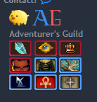
I don't want to take badge duty from J1M, I'm only an occasional poster on the forum and mostly a lurker. But I'd like to help badges section to look better. So below I'll raise some points about current badges, hopefully providing constructive criticism. It's still, of course, up to you guys what to do with all of it.
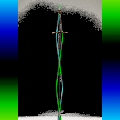
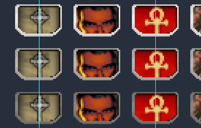
(grid is off by 1 pixel, but my OCD isn't strong enough right now to fix it again)
On the picture above you can also see how skewed current setup of badges is (shown in blue).
So "even" possible ratios utulised can be 46 width + 6 spacing OR 48 px width + 3 px spacing (assuming there is still 5 px edge on either side).
You can scale it down as well, but IMO 32 pixels right now is a bit too tiny CONSIDERING how busy some of the badges are. The badges where it's NOT just a logo / symbol on a blank background, but actually an artwork do not look well on 32 pixel space.
For me, the issue with brown is how it clashes with website itself. Forum is cool, while badges are all reading very warm with predominant use of brown. Brown also muddies the entire section of badges (especially with the scale of pictures being so teeny weeny), there's no definition between them, and I'll mention it again -- they are really too tightly put together, no room to breathe.
Should you wish to stick with the 32 px badges, here are my suggestions on how to make it read visually a bit better.
The biggest problem of old badges (imo) was only in part because of how they (styles) clashed with each other, but mostly it was because of how crooked whole "badges" section looked in the profile of a user + no cohesion in pictures used. Some are text, some are framed, some are not, some are smooth, some are heavily pixelated. The general idea of putting various pictures and game aesthetics IN FRAME (to unite those) that J1M had here is not bad, it's the execution that is lacking. Just make general frame small, preferably of cool colour (silver or blueish). Give inside of it some shadow / highlight. Make OG badges brown, gold, have a star on it or something. And -- of course -- make badges bigger and centered. All of that will make badges section clean, while also allowing games to "shine" better.
If necessary, I can provide a PSD template of sorts to use as base that can be tweaked however you guys want.
I don't want to take badge duty from J1M, I'm only an occasional poster on the forum and mostly a lurker. But I'd like to help badges section to look better. So below I'll raise some points about current badges, hopefully providing constructive criticism. It's still, of course, up to you guys what to do with all of it.
- Uneven spacing + Non-utilised space of the profile
► Unevenness
(grid is off by 1 pixel, but my OCD isn't strong enough right now to fix it again)
On the picture above you can also see how skewed current setup of badges is (shown in blue).
So "even" possible ratios utulised can be 46 width + 6 spacing OR 48 px width + 3 px spacing (assuming there is still 5 px edge on either side).
You can scale it down as well, but IMO 32 pixels right now is a bit too tiny CONSIDERING how busy some of the badges are. The badges where it's NOT just a logo / symbol on a blank background, but actually an artwork do not look well on 32 pixel space.
- Colour scheme
For me, the issue with brown is how it clashes with website itself. Forum is cool, while badges are all reading very warm with predominant use of brown. Brown also muddies the entire section of badges (especially with the scale of pictures being so teeny weeny), there's no definition between them, and I'll mention it again -- they are really too tightly put together, no room to breathe.
Should you wish to stick with the 32 px badges, here are my suggestions on how to make it read visually a bit better.
- 1. Consider adding shadows / highlights to make background stand out from the frame. If you take a look at VtMB or Redemption badges, the picture has subtle shadow (top shadow on VtMB and side shadow on Redemption). It allows for a slightly more clear definition even on low scale picture. BUT, since it's not uniform shadow, it also clashes with each other, so I'd suggest picking one shadow / highlight option.
2. Let brown background not be opaque, but transparent instead. Something between 25% and 40% should be alright. It'll just blend better with blue of the forum.
3. If badge has a single logo / symbol, let it have slight shadow around or underneath it.
4. Should you wish to keep brown cause it's dear to you guys, make OG badges have brown instead and the rest are gray / silver frames. Majority of badges would have that cool tone border that would fit better overall, but OG ones will stand out with brown.
5. If applying HQ colour scheme, keep OG badges in red and the rest in blue for the same reason of blue working better with forum and red standing out more.
6. Adding even 5 pixels to the height can do wonders, allowing (for example) crystal from Shard of Spring and symbol for Ambermoon to "fit" better in the box.
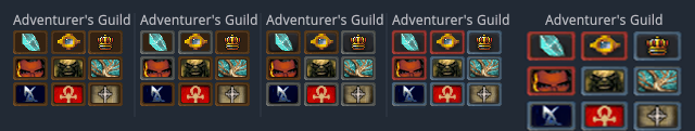
(1 - original, 2 - OG badges silver, 3 - OG badges brown + definition, 4 - HQ colour scheme, 5 - HQ + sized up (very poorly))
- Badges uniformity VS Badges uniqueness
The biggest problem of old badges (imo) was only in part because of how they (styles) clashed with each other, but mostly it was because of how crooked whole "badges" section looked in the profile of a user + no cohesion in pictures used. Some are text, some are framed, some are not, some are smooth, some are heavily pixelated. The general idea of putting various pictures and game aesthetics IN FRAME (to unite those) that J1M had here is not bad, it's the execution that is lacking. Just make general frame small, preferably of cool colour (silver or blueish). Give inside of it some shadow / highlight. Make OG badges brown, gold, have a star on it or something. And -- of course -- make badges bigger and centered. All of that will make badges section clean, while also allowing games to "shine" better.
If necessary, I can provide a PSD template of sorts to use as base that can be tweaked however you guys want.
-
J1M
- Turtle
- Posts: 5068
- Joined: Feb 15, '23
-
Geolocation
Adventurer's Guild
-
J1M
- Turtle
- Posts: 5068
- Joined: Feb 15, '23
-
Geolocation
Adventurer's Guild
Thanks for the feedback everyone. There were a range of responses. If you'd like the full context of where the first round of badge changes came from you can read this thread that I'm hoping a moderator will close so we don't have the conversation split across two locations.
These are the specific points I've distilled the feedback down into:
Merit badge:
@Silver @SpellSword @logincrash @Nemesis @Oyster Sauce @rusty_shackleford @1998 @WhiteShark
These are the specific points I've distilled the feedback down into:
- When I initially asked, it was decided that the junior guild should not be differentiated, but there appears to be an appetite for that now.
- While the integration of consistency was generally welcome, the sophisticated purveyors of this site see themselves as space marines, not boy scouts, and would rather have an image frame evocative of a military pin than a merit badge.
- Vertical space is extremely valuable due to the height limit of 22px. Reallocate some of this.
- Utilizing the background color is helpful for conveying ideas at this resolution, the Dragon Age badge is a great example of this.
- There were a number of negative comments about the plain brown background some of the badges have. These need to be updated. Open to suggestions.
- While it may be possible to create a 'silver' frame, I don't think 'gray' looks good on the background colors of this site. Use of brown initially was to convey the boy scout merit badge inspiration. To sell the concept of 'pins', I think the frames should be metallic.
- I created a new frame inspired by military pins to reclaim 3 pixels for content, allowing 15% more vertical information.
- A variety of frame colors are shown to narrow things down. I intend to put more effort into a specular highlight to make the frame look more metallic.
- The 'shield' shape is an experiment.
► Inspiration: military pins
@Silver @SpellSword @logincrash @Nemesis @Oyster Sauce @rusty_shackleford @1998 @WhiteShark
-
Oyster Sauce

- Site Moderator
- Posts: 11291
- Joined: Jun 2, '23
-
Geolocation
Adventurer's Guild
I like it. Would like to see the VTMR cross zoomed out a bit to give it more verticality, center it if possible, and match the VTMB one.J1M wrote: ↑ December 10th, 2024, 06:21Thanks for the feedback everyone. There were a range of responses. If you'd like the full context of where the first round of badge changes came from you can read this thread that I'm hoping a moderator will close so we don't have the conversation split across two locations.
These are the specific points I've distilled the feedback down into:Some iteration for people to provide feedback on:
- When I initially asked, it was decided that the junior guild should not be differentiated, but there appears to be an appetite for that now.
- While the integration of consistency was generally welcome, the sophisticated purveyors of this site see themselves as space marines, not boy scouts, and would rather have an image frame evocative of a military pin than a merit badge.
- Vertical space is extremely valuable due to the height limit of 22px. Reallocate some of this.
- Utilizing the background color is helpful for conveying ideas at this resolution, the Dragon Age badge is a great example of this.
- There were a number of negative comments about the plain brown background some of the badges have. These need to be updated. Open to suggestions.
- While it may be possible to create a 'silver' frame, I don't think 'gray' looks good on the background colors of this site. Use of brown initially was to convey the boy scout merit badge inspiration. To sell the concept of 'pins', I think the frames should be metallic.
- I created a new frame inspired by military pins to reclaim 3 pixels for content, allowing 15% more vertical information.
- A variety of frame colors are shown to narrow things down. I intend to put more effort into a specular highlight to make the frame look more metallic.
- The 'shield' shape is an experiment.
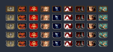
Merit badge:► Inspiration: military pinsMilitary pin:


@Silver @SpellSword @logincrash @Nemesis @Oyster Sauce @rusty_shackleford @1998 @WhiteShark
-
logincrash

- The Music Man
- Posts: 6039
- Joined: Sep 3, '23
- Location: Niger
-
Geolocation
Adventurer's Guild
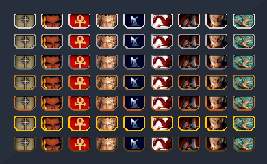
I like the shape. Looks much better. VtMB ankh looks much better than on the merit badge.
Second row from the top looks the best, frame color wise, I think. Not too bright and not ****-brown.
Second row from the bottom could look a bit better if it was a little more subtle. And gold frame could be used for the OG AG games.
"Oh, it all makes sense now, brother."
-
SpellSword
- Posts: 1324
- Joined: Jun 15, '23
-
Geolocation
Adventurer's Guild
@J1M Glorious! I really like the Military pin design. The VtM Redemption & Bloodlines badges really benefit from those extra three pixels of vertical space.
J1M wrote: ↑ December 10th, 2024, 06:21[*]While the integration of consistency was generally welcome, the sophisticated purveyors of this site see themselves as space marines, not boy scouts, and would rather have an image frame evocative of a military pin than a merit badge.
You do not have the required permissions to view the files attached to this post.
The three evils that humanity faces:
Censorship
Telemetry
DRM
-
WhiteShark
- Site Moderator
- Posts: 5056
- Joined: Feb 2, '23
-
Geolocation
Adventurer's Guild
I actually prefer the third row. You've said you wanted to avoid grey, @J1M, but I actually prefer the muted color because it doesn't draw the eye away from the content of the badge. With the rest, to a greater or lesser degree, I feel that the first thing I see when I look at them is the border, not the logo.logincrash wrote: ↑ December 10th, 2024, 07:13I like the shape. Looks much better. VtMB ankh looks much better than on the merit badge.
Second row from the top looks the best, frame color wise, I think. Not too bright and not ****-brown.
Second row from the bottom could look a bit better if it was a little more subtle. And gold frame could be used for the OG AG games.
-
TKVNC

- Posts: 3079
- Joined: Feb 25, '24
-
Geolocation
Adventurer's Guild
Wew ladJ1M wrote: ↑ December 10th, 2024, 06:21Thanks for the feedback everyone. There were a range of responses. If you'd like the full context of where the first round of badge changes came from you can read this thread that I'm hoping a moderator will close so we don't have the conversation split across two locations.
These are the specific points I've distilled the feedback down into:Some iteration for people to provide feedback on:
- When I initially asked, it was decided that the junior guild should not be differentiated, but there appears to be an appetite for that now.
- While the integration of consistency was generally welcome, the sophisticated purveyors of this site see themselves as space marines, not boy scouts, and would rather have an image frame evocative of a military pin than a merit badge.
- Vertical space is extremely valuable due to the height limit of 22px. Reallocate some of this.
- Utilizing the background color is helpful for conveying ideas at this resolution, the Dragon Age badge is a great example of this.
- There were a number of negative comments about the plain brown background some of the badges have. These need to be updated. Open to suggestions.
- While it may be possible to create a 'silver' frame, I don't think 'gray' looks good on the background colors of this site. Use of brown initially was to convey the boy scout merit badge inspiration. To sell the concept of 'pins', I think the frames should be metallic.
- I created a new frame inspired by military pins to reclaim 3 pixels for content, allowing 15% more vertical information.
- A variety of frame colors are shown to narrow things down. I intend to put more effort into a specular highlight to make the frame look more metallic.
- The 'shield' shape is an experiment.
Merit badge:► Inspiration: military pinsMilitary pin:
@Silver @SpellSword @logincrash @Nemesis @Oyster Sauce @rusty_shackleford @1998 @WhiteShark
That's some nice work. 3rd from top is the nicest accent colour imo
My Mods:
Kenshi:
viewtopic.php?t=3219-under-armour-edits-1-0-kenshi - Under Armour Edits
viewtopic.php?f=26&t=3262-face-expansion-1-0-kenshi - Face Expansion
Kenshi:
viewtopic.php?t=3219-under-armour-edits-1-0-kenshi - Under Armour Edits
viewtopic.php?f=26&t=3262-face-expansion-1-0-kenshi - Face Expansion
-
rusty_shackleford

- Site Admin
- Posts: 45453
- Joined: Feb 2, '23
- Gender: Watermelon
-
Geolocation
Adventurer's Guild
Looks great to me. Whatever @Oyster Sauce settles on I'll swap the badges out to.J1M wrote: ↑ December 10th, 2024, 06:21Thanks for the feedback everyone. There were a range of responses. If you'd like the full context of where the first round of badge changes came from you can read this thread that I'm hoping a moderator will close so we don't have the conversation split across two locations.
These are the specific points I've distilled the feedback down into:Some iteration for people to provide feedback on:
- When I initially asked, it was decided that the junior guild should not be differentiated, but there appears to be an appetite for that now.
- While the integration of consistency was generally welcome, the sophisticated purveyors of this site see themselves as space marines, not boy scouts, and would rather have an image frame evocative of a military pin than a merit badge.
- Vertical space is extremely valuable due to the height limit of 22px. Reallocate some of this.
- Utilizing the background color is helpful for conveying ideas at this resolution, the Dragon Age badge is a great example of this.
- There were a number of negative comments about the plain brown background some of the badges have. These need to be updated. Open to suggestions.
- While it may be possible to create a 'silver' frame, I don't think 'gray' looks good on the background colors of this site. Use of brown initially was to convey the boy scout merit badge inspiration. To sell the concept of 'pins', I think the frames should be metallic.
- I created a new frame inspired by military pins to reclaim 3 pixels for content, allowing 15% more vertical information.
- A variety of frame colors are shown to narrow things down. I intend to put more effort into a specular highlight to make the frame look more metallic.
- The 'shield' shape is an experiment.
Merit badge:► Inspiration: military pinsMilitary pin:
@Silver @SpellSword @logincrash @Nemesis @Oyster Sauce @rusty_shackleford @1998 @WhiteShark
Thank you for your attention to this matter!
Steam friend code: 40552640 https://steamcommunity.com/friends/add | email: [email protected]
Having trouble running an old Windows game?
Rusty's Stuff Collection
Steam friend code: 40552640 https://steamcommunity.com/friends/add | email: [email protected]
Having trouble running an old Windows game?
Rusty's Stuff Collection
-
Nemesis
- Director of Synchronous Communication Channels
- Posts: 1241
- Joined: Feb 2, '23
-
Geolocation
Adventurer's Guild
Nice work, and thanks for the update. I like the third row of the military pins.J1M wrote: ↑ December 10th, 2024, 06:21Thanks for the feedback everyone. There were a range of responses. If you'd like the full context of where the first round of badge changes came from you can read this thread that I'm hoping a moderator will close so we don't have the conversation split across two locations.
These are the specific points I've distilled the feedback down into:Some iteration for people to provide feedback on:
- When I initially asked, it was decided that the junior guild should not be differentiated, but there appears to be an appetite for that now.
- While the integration of consistency was generally welcome, the sophisticated purveyors of this site see themselves as space marines, not boy scouts, and would rather have an image frame evocative of a military pin than a merit badge.
- Vertical space is extremely valuable due to the height limit of 22px. Reallocate some of this.
- Utilizing the background color is helpful for conveying ideas at this resolution, the Dragon Age badge is a great example of this.
- There were a number of negative comments about the plain brown background some of the badges have. These need to be updated. Open to suggestions.
- While it may be possible to create a 'silver' frame, I don't think 'gray' looks good on the background colors of this site. Use of brown initially was to convey the boy scout merit badge inspiration. To sell the concept of 'pins', I think the frames should be metallic.
- I created a new frame inspired by military pins to reclaim 3 pixels for content, allowing 15% more vertical information.
- A variety of frame colors are shown to narrow things down. I intend to put more effort into a specular highlight to make the frame look more metallic.
- The 'shield' shape is an experiment.
Merit badge:► Inspiration: military pinsMilitary pin:
@Silver @SpellSword @logincrash @Nemesis @Oyster Sauce @rusty_shackleford @1998 @WhiteShark
-
J1M
- Turtle
- Posts: 5068
- Joined: Feb 15, '23
-
Geolocation
Adventurer's Guild
Achievement unlocked: Pixel HunterSilver wrote: ↑ December 10th, 2024, 16:40@J1M You REALLY like tiny stuff, huh.
2nd or 3rd row look the best colour wise for the frame.
I don't know what software you use to align background inside, but I HIGHLY recommend using guides, because well...
► Show Spoiler
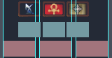
I shifted the ankh over one pixel to see if people would comment on that or the ankh's color change.
I didn't pick the size constraint. I'm planning to create 44px versions so they don't look so pixelated at x2 size, and have advocated that rusty remove the x3 size entirely since it only appears on one page. Exporting these is tedious so I'm not putting much effort into the individual images until this frame thing is locked down.
-
rusty_shackleford
- Site Admin
- Posts: 45453
- Joined: Feb 2, '23
- Gender: Watermelon
-
Geolocation
Adventurer's Guild
The badges have to be tiny because there's a lot of them. Another year and people's profile fields would start being longer than the messages.
Thank you for your attention to this matter!
Steam friend code: 40552640 https://steamcommunity.com/friends/add | email: [email protected]
Having trouble running an old Windows game?
Rusty's Stuff Collection
Steam friend code: 40552640 https://steamcommunity.com/friends/add | email: [email protected]
Having trouble running an old Windows game?
Rusty's Stuff Collection
-
Finarfin
- Connoisseur of Slop
- Posts: 5020
- Joined: May 20, '24
- Location: Tirion upon Túna
-
Geolocation
Adventurer's Guild
Hell yeah. Like on the Path of Exile Forum.rusty_shackleford wrote: ↑ December 10th, 2024, 19:34The badges have to be tiny because there's a lot of them. Another year and people's profile fields would start being longer than the messages.

Steam code: 10514930
My Reviews:
El Matador RECOMMENDED
Dungeons of Sundaria NOT RECOMMENDED
VLADiK BRUTAL RECOMMENDED
Ultimate Zombie Defense 2 INFORMATIONAL
Deathless: The Hero Quest RECOMMENDED
Door Kickers 2 RECOMMENDED
Folklands INFORMATIONAL
My Reviews:
El Matador RECOMMENDED
Dungeons of Sundaria NOT RECOMMENDED
VLADiK BRUTAL RECOMMENDED
Ultimate Zombie Defense 2 INFORMATIONAL
Deathless: The Hero Quest RECOMMENDED
Door Kickers 2 RECOMMENDED
Folklands INFORMATIONAL
-
J1M
- Turtle
- Posts: 5068
- Joined: Feb 15, '23
-
Geolocation
Adventurer's Guild
► Inspiration: military pins
Regarding differentiation of the original adventurer's guild, I am not really a fan of using the border color to do that. Many of them have pixel-art icons due to their publishing date. I think using pixel art icons on top of a two-tone classic shield background would appropriately differentiate them and solve the "too much brown" feedback about the background color. This would also address some very early feedback about reverting the Strahd image.
Like this, but 22px high:

-
Oyster Sauce
- Site Moderator
- Posts: 11291
- Joined: Jun 2, '23
-
Geolocation
Adventurer's Guild
you pickrusty_shackleford wrote: ↑ December 10th, 2024, 09:44Looks great to me. Whatever @Oyster Sauce settles on I'll swap the badges out to.J1M wrote: ↑ December 10th, 2024, 06:21Thanks for the feedback everyone. There were a range of responses. If you'd like the full context of where the first round of badge changes came from you can read this thread that I'm hoping a moderator will close so we don't have the conversation split across two locations.
These are the specific points I've distilled the feedback down into:Some iteration for people to provide feedback on:
- When I initially asked, it was decided that the junior guild should not be differentiated, but there appears to be an appetite for that now.
- While the integration of consistency was generally welcome, the sophisticated purveyors of this site see themselves as space marines, not boy scouts, and would rather have an image frame evocative of a military pin than a merit badge.
- Vertical space is extremely valuable due to the height limit of 22px. Reallocate some of this.
- Utilizing the background color is helpful for conveying ideas at this resolution, the Dragon Age badge is a great example of this.
- There were a number of negative comments about the plain brown background some of the badges have. These need to be updated. Open to suggestions.
- While it may be possible to create a 'silver' frame, I don't think 'gray' looks good on the background colors of this site. Use of brown initially was to convey the boy scout merit badge inspiration. To sell the concept of 'pins', I think the frames should be metallic.
- I created a new frame inspired by military pins to reclaim 3 pixels for content, allowing 15% more vertical information.
- A variety of frame colors are shown to narrow things down. I intend to put more effort into a specular highlight to make the frame look more metallic.
- The 'shield' shape is an experiment.
Merit badge:► Inspiration: military pinsMilitary pin:
@Silver @SpellSword @logincrash @Nemesis @Oyster Sauce @rusty_shackleford @1998 @WhiteShark