

arisen wrote: ↑ February 19th, 2025, 18:54Lmao, what did I expect.arisen wrote: ↑ February 18th, 2025, 09:47jawstarion also has no ******* clue how to pose as a dude online, a 7th grade feminist knows how to pull this **** better than she does.

We have a Steam curator now. You should be following it. https://store.steampowered.com/curator/44994899-RPGHQ/
Mod seethe thread (formerly Nexus seethe thread)
-
Tweed

- Turtle

- Posts: 6837
- Joined: Feb 2, '23
-
Geolocation
Adventurer's Guild
-
Silver

- Posts: 471
- Joined: Dec 4, '23
-
Geolocation
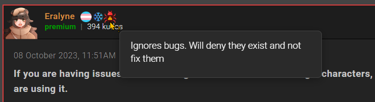
Disgust reaction whence?arisen wrote: ↑ February 19th, 2025, 18:54Lmao, what did I expect.arisen wrote: ↑ February 18th, 2025, 09:47jawstarion also has no ******* clue how to pose as a dude online, a 7th grade feminist knows how to pull this **** better than she does.
-
Envergence

- Posts: 251
- Joined: Dec 8, '23
- Location: You'll N'wahs Don't Even Smoke Skooma
-
Geolocation
-
loregamer

- Site Moderator
- Posts: 5065
- Joined: Dec 3, '23
-
Geolocation
I think we need to just start doing single smiley  replies out of protest
Last edited by loregamer on February 19th, 2025, 20:54, edited 1 time in total.
Jingle Jangle Jingle
-
Finarfin

- Connoisseur of Slop
- Posts: 5020
- Joined: May 20, '24
- Location: Tirion upon Túna
-
Geolocation
Adventurer's Guild
arisen wrote: ↑ February 19th, 2025, 18:54Lmao, what did I expect.arisen wrote: ↑ February 18th, 2025, 09:47jawstarion also has no ******* clue how to pose as a dude online, a 7th grade feminist knows how to pull this **** better than she does.
Steam code: 10514930
My Reviews:
El Matador RECOMMENDED
Dungeons of Sundaria NOT RECOMMENDED
VLADiK BRUTAL RECOMMENDED
Ultimate Zombie Defense 2 INFORMATIONAL
Deathless: The Hero Quest RECOMMENDED
Door Kickers 2 RECOMMENDED
Folklands INFORMATIONAL
My Reviews:
El Matador RECOMMENDED
Dungeons of Sundaria NOT RECOMMENDED
VLADiK BRUTAL RECOMMENDED
Ultimate Zombie Defense 2 INFORMATIONAL
Deathless: The Hero Quest RECOMMENDED
Door Kickers 2 RECOMMENDED
Folklands INFORMATIONAL
-
loregamer
- Site Moderator
- Posts: 5065
- Joined: Dec 3, '23
-
Geolocation
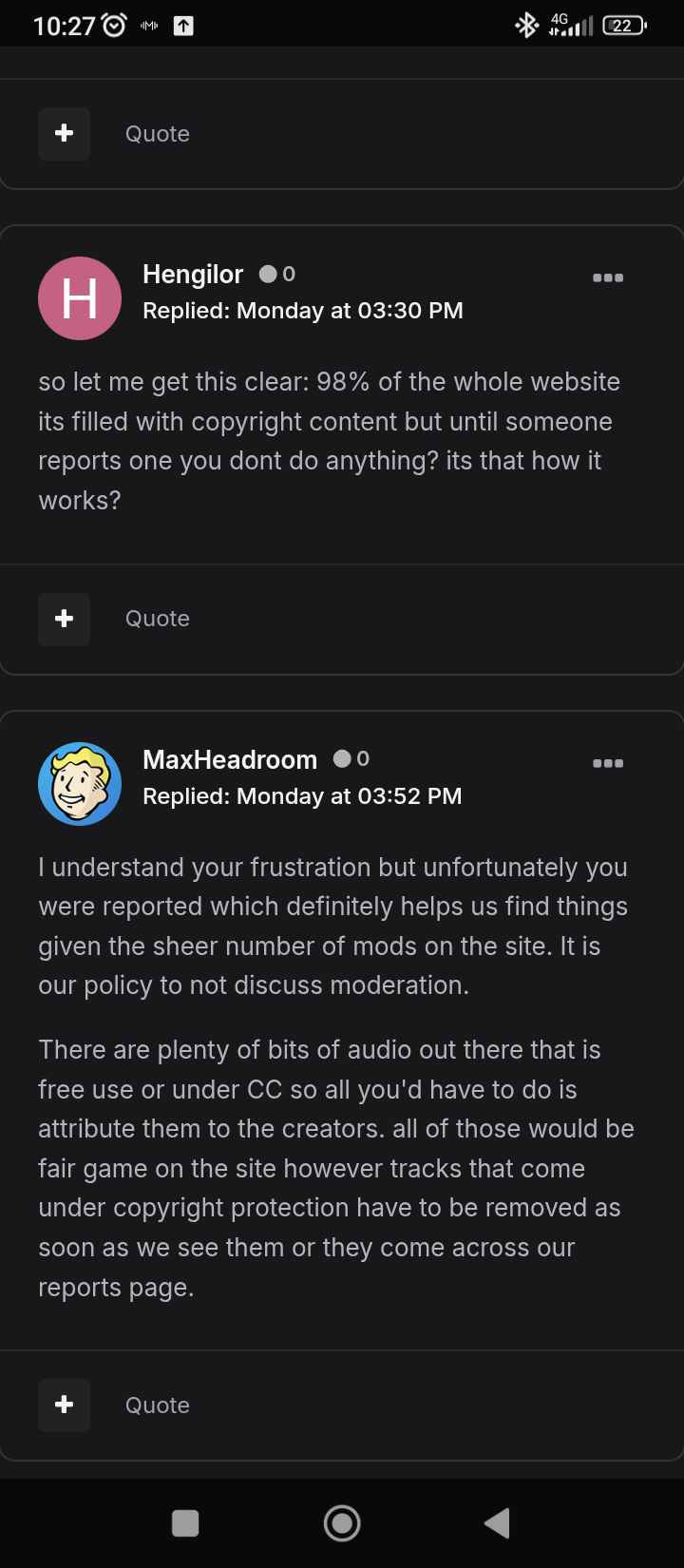
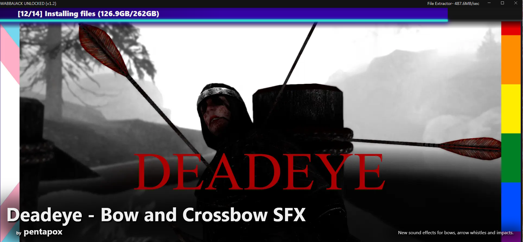
We have the potential to do something really funny…Oyster Sauce wrote: ↑ February 19th, 2025, 11:37Allegedly Nexus janitors have to remove ANY copyrighted material that gets reported. They just let everything slide until then
Jingle Jangle Jingle
-
Silver
- Posts: 471
- Joined: Dec 4, '23
-
Geolocation
I know. I actually don't remember who exactly used it as "when / whence", but I found it funny in a silly way.
-
loregamer
- Site Moderator
- Posts: 5065
- Joined: Dec 3, '23
-
Geolocation
loregamer wrote: ↑ February 21st, 2025, 23:26
There's no escaping these people
>gay thumbnail
>closed permissions policy
>not even their own sound effects
>but they are accepting donations for it!

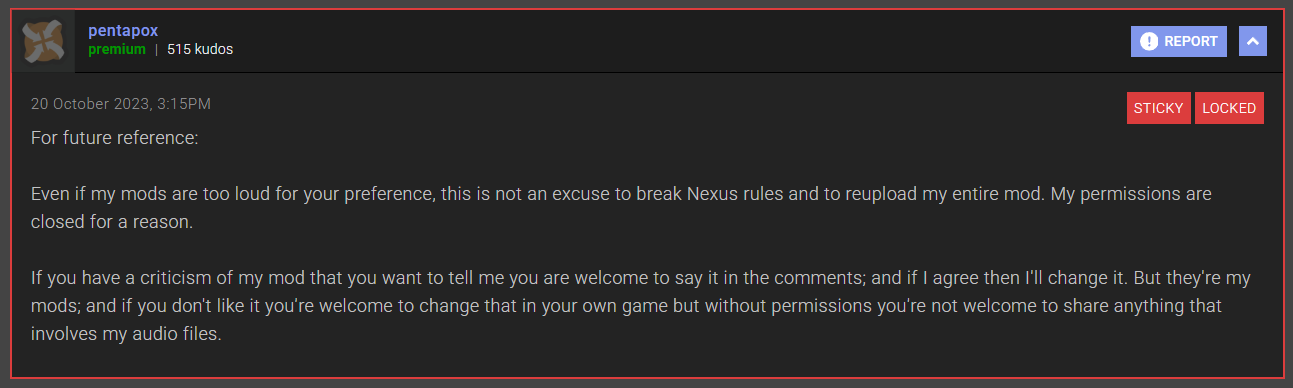
Jingle Jangle Jingle
-
loregamer
- Site Moderator
- Posts: 5065
- Joined: Dec 3, '23
-
Geolocation
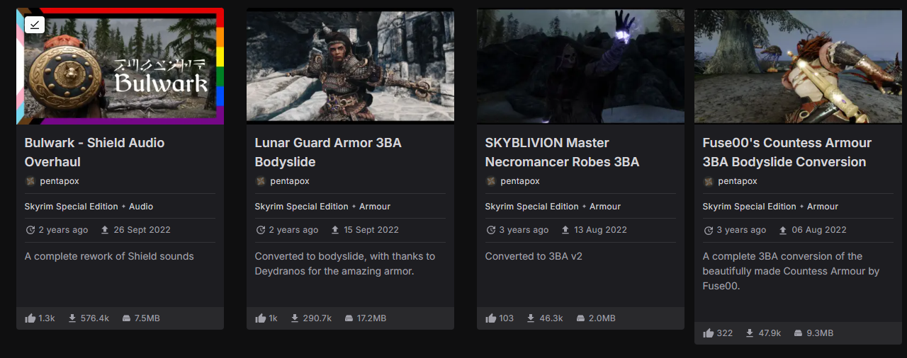
The BodySlide Modder to ***** pipeline is real

Last edited by loregamer on February 21st, 2025, 23:34, edited 1 time in total.
Jingle Jangle Jingle
-
UltraFan123

- Posts: 2647
- Joined: May 25, '24
- Gender: Potato
-
Geolocation
If we thought that the spread of the mindvirus was bad before the vibe shift began to bring back normalcy, then we should buckle up for the final death screeches of the dying animal.
Of course, they will eventually get properly demoralized, but right now they're still in their delusional "WE CAN FIGHT AND RESIST BLOMPF!!" stage which means that they will put their ****** *** everywhere they can.
-
Wretch

- Posts: 1037
- Joined: Dec 3, '23
-
Geolocation
This is red7’s alt
-
Rand

- Posts: 6640
- Joined: Sep 4, '23
- Location: On my last legs
-
Geolocation
Adventurer's Guild
He's a piece of ****. **** him and his wants.loregamer wrote: ↑ February 21st, 2025, 23:28loregamer wrote: ↑ February 21st, 2025, 23:26
There's no escaping these people
>gay thumbnail
>closed permissions policy
>not even their own sound effects
>but they are accepting donations for it!
You may as well not bother replying to my posts if it's to argue anything except concrete facts or your personal opinion. I still probably won't see it.
Reject your retarded-wing political programming and learn to think.
If you can.
Reject your retarded-wing political programming and learn to think.
If you can.
-
loregamer
- Site Moderator
- Posts: 5065
- Joined: Dec 3, '23
-
Geolocation
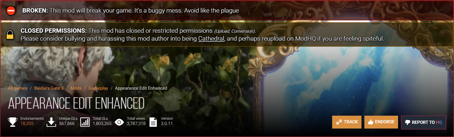
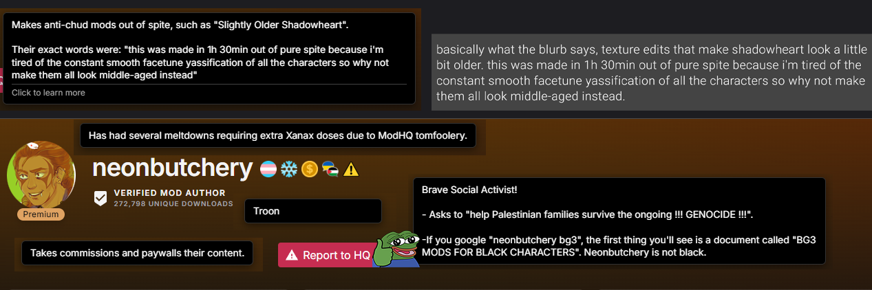
I've started a Nexus Mods Content Curator userscript if you guys would like to use and possibly help contribute:
Nexus Mods Content Curator 1.0 — Userscript
![Image]()
![Image]()
Nexus Mods Content Curator 1.0 — Userscript

Jingle Jangle Jingle
-
Silver
- Posts: 471
- Joined: Dec 4, '23
-
Geolocation
Average Nexus Modder ***
*** Discord grooming might be included

► Static image
-
Maximus

- Posts: 17
- Joined: Jul 27, '24
-
Geolocation
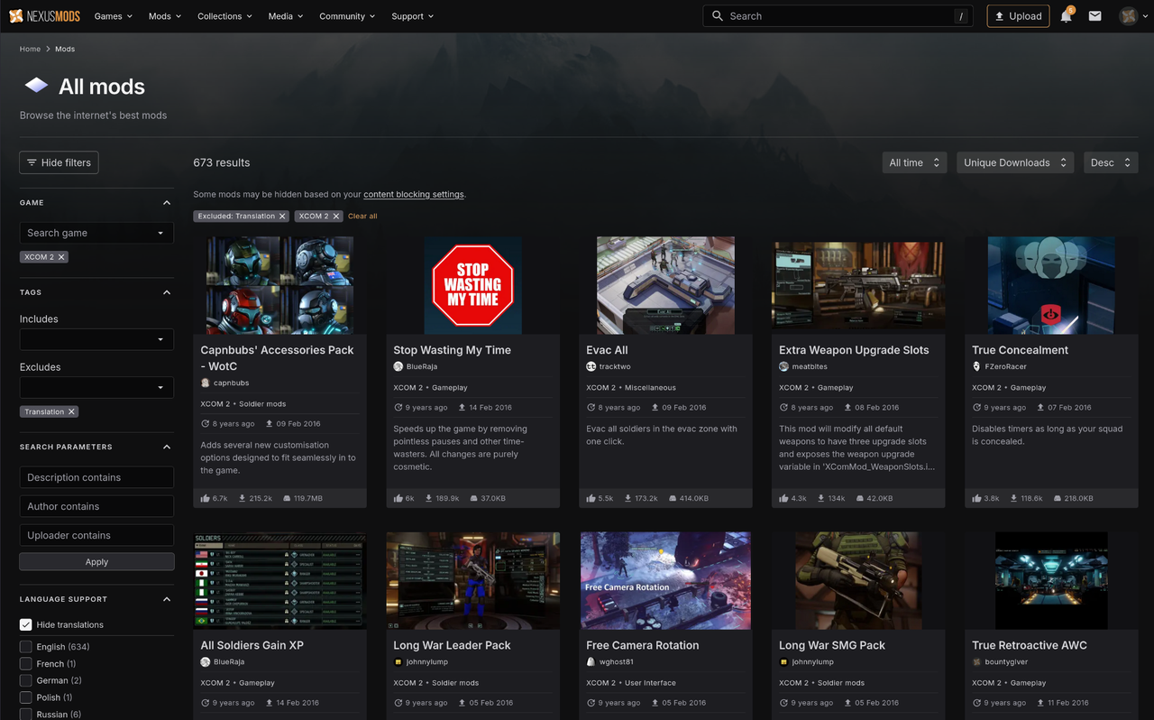
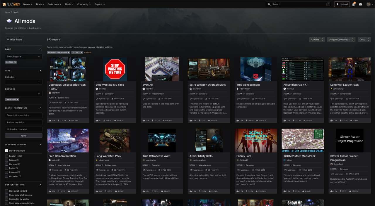
Anyone visited Nexus lately and seen the latest UI layout changes for the page, that is forced on everybody?
The "feedback" forum are burning cesspit the last few days. It's a dumpster fire in free-fall, and the Nexus staff aren't taking the "feedback" very well.
They are on good track to bust the reply record from 2015 when Skyrim got Creation club. The problem now, is that EVERYBODY are hating the new layout.
Forum thread
-
Vaako

- Posts: 1544
- Joined: Oct 17, '23
-
Geolocation
yeah I already complained about that, looked better before. hopefully it dies now and we get some other site taking overMaximus wrote: ↑ March 21st, 2025, 19:16Anyone visited Nexus lately and seen the latest UI layout changes for the page, that is forced on everybody?
The "feedback" forum are burning cesspit the last few days. It's a dumpster fire in free-fall, and the Nexus staff aren't taking the "feedback" very well.
They are on good track to bust the reply record from 2015 when Skyrim got Creation club. The problem now, is that EVERYBODY are hating the new layout.
Forum thread
Last edited by Vaako on March 21st, 2025, 19:20, edited 1 time in total.
"I don't care what they tell you in College of Winterhold, Tiber Septim was a Redguard.”
-
UltraFan123
- Posts: 2647
- Joined: May 25, '24
- Gender: Potato
-
Geolocation
Hopefully all or at least most of the mods are salvageable when Cucksus Mods finally collapses.
-
arisen

- Posts: 219
- Joined: Apr 4, '24
-
Geolocation
The UI is absolute ***. They raw dogged functionality worse than your average Victorian family tree. I don't get why beat what already worked with a shovel and say "here, get ******, you ungrateful swine". The filter tab is just a huge toilet paper you have to scroll down just to switch off translations, ReShade and saves... every. *******. time. It's even worse when you use a smartphone.Maximus wrote: ↑ March 21st, 2025, 19:16Anyone visited Nexus lately and seen the latest UI layout changes for the page, that is forced on everybody?
The "feedback" forum are burning cesspit the last few days. It's a dumpster fire in free-fall, and the Nexus staff aren't taking the "feedback" very well.
They are on good track to bust the reply record from 2015 when Skyrim got Creation club. The problem now, is that EVERYBODY are hating the new layout.
Forum thread
-
Oyster Sauce

- Site Moderator
- Posts: 11294
- Joined: Jun 2, '23
-
Geolocation
Adventurer's Guild
holy ******* moly this is bad
-
DagothGeas5

- Posts: 2590
- Joined: Dec 13, '23
-
Geolocation
Adventurer's Guild
I was inspired to go look for myself and it indeed is worse than I expected. The singular mod pages look like an archived version or something of the sort. It feels like Nexus is shutting down just by how it looks.
- Here to show my support for normal gaming.
Thank you for existing!
Thank you for existing!
-
Demonic Fate

- Posts: 694
- Joined: Feb 19, '25
-
Geolocation
Adventurer's Guild
The old search interface sucked *** too, just in a different way. Hiding filters under a collapsible tab, never-fixed bugs with the text fields, tiny listboxes holding huge lists of categories you had to scroll through, weird positioning. It was textbook "we designed this UI ten years ago when it had like three options and then we just added stuff piecemeal without thinking" webdev.
The #1 issue with the new one is that it doesn't save your search preferences in your cookies. This is a massive oversight and they need to fix this ASAP - it shouldn't be hard. Thankfully the "Hide Translations" button is now prominent and easy to reach, instead of being buried among the category list.
The #2 issue with this one is the size and wasted space, which is why so many of the normies are yelling that it feels like a phone UI. This one is partially fixed by zooming out a couple of ticks, then it looks much better
But I say "partially" because they hardcoded a CSS width that tops out at five mods per row for, as best as I can tell, no goddamn reason.
(Or rather, I can guess: the CSS bootcamps those pajeets went through taught them to limit max width, because they were being trained to churn out blogspam, and text should not stretch out too wide else it becomes annoying to read. But the content here is a list of cards, not AI-generated slop text, so the rule doesn't apply - but you can't expect critical thinking of pajeets)
Remove the max-width: 1920px; attribute from the CSS because it's 2025 and non-poor people have ultrawide and 4k screens, and it gets actually usable:
The #1 issue with the new one is that it doesn't save your search preferences in your cookies. This is a massive oversight and they need to fix this ASAP - it shouldn't be hard. Thankfully the "Hide Translations" button is now prominent and easy to reach, instead of being buried among the category list.
The #2 issue with this one is the size and wasted space, which is why so many of the normies are yelling that it feels like a phone UI. This one is partially fixed by zooming out a couple of ticks, then it looks much better
► Show Spoiler
(Or rather, I can guess: the CSS bootcamps those pajeets went through taught them to limit max width, because they were being trained to churn out blogspam, and text should not stretch out too wide else it becomes annoying to read. But the content here is a list of cards, not AI-generated slop text, so the rule doesn't apply - but you can't expect critical thinking of pajeets)
► Show Spoiler

► Show Spoiler
-
Shillitron

- Posts: 3707
- Joined: Feb 6, '23
- Location: ADL Head Office
-
Geolocation
I like the new UI.. because I hated the old UI which was actually the "new UI" 6[?] years ago. 
Nexus did a UI overhaul around the time they started developing NMM.. but they didn't overhaul it all and it made many of their Filter pages wildly inconsistent. Some filters were only available on the "6 years ago new UI" and some were only available in the "old UI" which required you navigating to certain pages for certain games.
With the Newest UI they have consolidated all filters on a single searchable mod page and you can persist / push filters between Sessions.
One thing that is annoying though is the date limit on the new page jumps from "All Time" to "One Year" - I want the Date Range filter back.
EDIT:
I opened the seethe forum thread for some good laughs of watching people sperg out and the first Janny post is they are gonna fix the date range thing.
Last edited by Shillitron on March 22nd, 2025, 12:24, edited 5 times in total.
---
-
Unhelpful Contrarian

- Posts: 3187
- Joined: Aug 24, '24
-
Geolocation
It’s takes a **** ton of time and resources. There’s a reason why even the most seasoned well known mod team making small game projects get abandonedmaidenhaver wrote: ↑ February 19th, 2025, 14:47What's stopping our modders from making actual games?
-
loregamer
- Site Moderator
- Posts: 5065
- Joined: Dec 3, '23
-
Geolocation
I hate how Modernized UI Design is just removing icons from buttons and tabs and making things as monochromatic as possible. I want the complete opposite. Love buttons having icons and **** being colorful
Jingle Jangle Jingle
-
rusty_shackleford

- Site Admin
- Posts: 45469
- Joined: Feb 2, '23
- Gender: Watermelon
-
Geolocation
Adventurer's Guild
is this the thread for posting hq modder seething
Thank you for your attention to this matter!
Steam friend code: 40552640 https://steamcommunity.com/friends/add | email: [email protected]
Having trouble running an old Windows game?
Rusty's Stuff Collection
Steam friend code: 40552640 https://steamcommunity.com/friends/add | email: [email protected]
Having trouble running an old Windows game?
Rusty's Stuff Collection
-
Vergil

- Posts: 15670
- Joined: Sep 6, '23
-
Geolocation
tfw I want to download a mod that looks cool but I haven't run it through the "based or not" registry to get permission first 
I'm just stating the facts.
Question is are you going to gargle the truth or swallow?
Question is are you going to gargle the truth or swallow?
-
Acrux

- Turtle
- Posts: 6559
- Joined: Feb 8, '23
-
Geolocation
Adventurer's Guild
Nobody but designers like it. At my work we went through a period a few years ago of transforming the UI to modern design and customers absolutely hated it, couldn't find things as easily, and were generally slower and less successful at tasks. We went back to including the icons and other reverts.loregamer wrote: ↑ March 22nd, 2025, 20:03I hate how Modernized UI Design is just removing icons from buttons and tabs and making things as monochromatic as possible. I want the complete opposite. Love buttons having icons and **** being colorful
Personally, I still really like skeuomorphic design.
-
Tangerine

- Posts: 3593
- Joined: Dec 1, '24
-
Geolocation
Adventurer's Guild
It's low effort and easy, but they'll act like it's a Herculean task to pick the right combination of colors.Acrux wrote: ↑ March 22nd, 2025, 22:08Nobody but designers like it. At my work we went through a period a few years ago of transforming the UI to modern design and customers absolutely hated it, couldn't find things as easily, and were generally slower and less successful at tasks. We went back to including the icons and other reverts.loregamer wrote: ↑ March 22nd, 2025, 20:03I hate how Modernized UI Design is just removing icons from buttons and tabs and making things as monochromatic as possible. I want the complete opposite. Love buttons having icons and **** being colorful
Personally, I still really like skeuomorphic design.
-
rusty_shackleford
- Site Admin
- Posts: 45469
- Joined: Feb 2, '23
- Gender: Watermelon
-
Geolocation
Adventurer's Guild
HQ's color palette was the result of thousands of hours of workTangerine wrote: ↑ March 22nd, 2025, 22:22It's low effort and easy, but they'll act like it's a Herculean task to pick the right combination of colors.Acrux wrote: ↑ March 22nd, 2025, 22:08Nobody but designers like it. At my work we went through a period a few years ago of transforming the UI to modern design and customers absolutely hated it, couldn't find things as easily, and were generally slower and less successful at tasks. We went back to including the icons and other reverts.loregamer wrote: ↑ March 22nd, 2025, 20:03I hate how Modernized UI Design is just removing icons from buttons and tabs and making things as monochromatic as possible. I want the complete opposite. Love buttons having icons and **** being colorful
Personally, I still really like skeuomorphic design.
Thank you for your attention to this matter!
Steam friend code: 40552640 https://steamcommunity.com/friends/add | email: [email protected]
Having trouble running an old Windows game?
Rusty's Stuff Collection
Steam friend code: 40552640 https://steamcommunity.com/friends/add | email: [email protected]
Having trouble running an old Windows game?
Rusty's Stuff Collection
-
MrTwinkls

- Posts: 645
- Joined: Mar 12, '24
-
Geolocation
Where is the map in the background from?rusty_shackleford wrote: ↑ March 22nd, 2025, 22:44HQ's color palette was the result of thousands of hours of workTangerine wrote: ↑ March 22nd, 2025, 22:22It's low effort and easy, but they'll act like it's a Herculean task to pick the right combination of colors.Acrux wrote: ↑ March 22nd, 2025, 22:08
Nobody but designers like it. At my work we went through a period a few years ago of transforming the UI to modern design and customers absolutely hated it, couldn't find things as easily, and were generally slower and less successful at tasks. We went back to including the icons and other reverts.
Personally, I still really like skeuomorphic design.