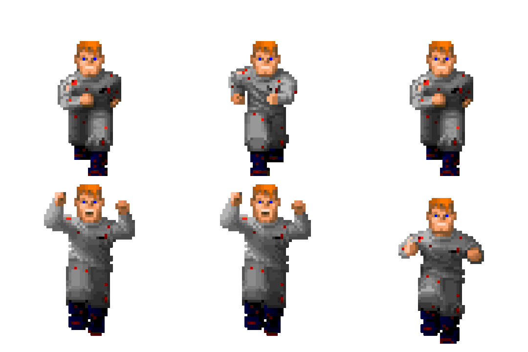
 Who do I have to bully to put an end to this?
We have a Steam curator now. You should be following it. https://store.steampowered.com/curator/44994899-RPGHQ/
"Bouncing" pixel art looks fucking terrible
- rusty_shackleford
- Site Admin
- Posts: 10235
- Joined: Feb 2, '23
- Contact:
"Bouncing" pixel art looks fucking terrible
 Who do I have to bully to put an end to this?
Personally I think all pixel art looks terrible and should be left to the confines of history.
inb4 someone posts a bunch of screenshots from their favorite 2d era console. Sorry, you're not going to convince me.
inb4 someone posts a bunch of screenshots from their favorite 2d era console. Sorry, you're not going to convince me.
- rusty_shackleford
- Site Admin
- Posts: 10235
- Joined: Feb 2, '23
- Contact:
This looks like absolute trash. People do not bob in place like this.
The games they're trying to be like never looked like this.
The characters are not bouncing around like they have untreated ADHD.
The games they're trying to be like never looked like this.
The characters are not bouncing around like they have untreated ADHD.
- KnightoftheWind
- Posts: 1618
- Joined: Feb 27, '23
Typical Zoomer. Say what you will about indie game tripe, but the era of pixel art ended far too early. It was just reaching it's prime with some Saturn/PS1 games, not to mention some NeoGeo heavy-hitters like Metal Slug.GhostCow wrote: ↑ May 11th, 2023, 23:19Personally I think all pixel art looks terrible and should be left to the confines of history.
inb4 someone posts a bunch of screenshots from their favorite 2d era console. Sorry, you're not going to convince me.
I'm 39 you dumbfuck. Metal Slug looks good for it's era, but it's an art style that we had to use because of technical limitations. Not because it looked good.
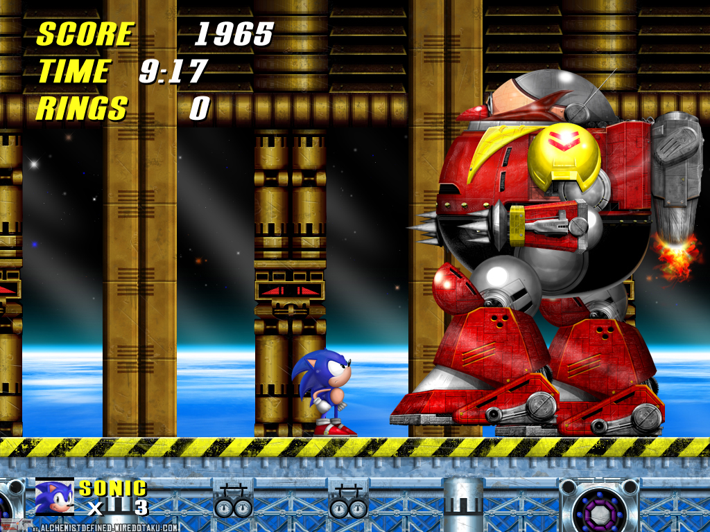
This is what 2d art should look like in 2023. There is no excuse for pixelshit of any kind.
Shantae and the Seven Sirens is bouncy and looks good because it's not pixelshit.



- WhiteShark
- Turtle

- Posts: 2093
- Joined: Feb 2, '23
Shantae looks great as always but that Sonic screenshot looks awful. I hope that's a mockup and not from an actual game.GhostCow wrote: ↑ May 11th, 2023, 23:32This is what 2d art should look like in 2023. There is no excuse for pixelshit of any kind.
Anyway, bouncing sprites are neat when they aren't overdone:


- KnightoftheWind
- Posts: 1618
- Joined: Feb 27, '23
Man your tastes really suck ass. You're saying you prefer 2D Flash/Newgrounds style animation over quality sprite work?.GhostCow wrote: ↑ May 11th, 2023, 23:32I'm 39 you dumbfuck. Metal Slug looks good for it's era, but it's an art style that we had to use because of technical limitations. Not because it looked good.
This is what 2d art should look like in 2023. There is no excuse for pixelshit of any kind.
Shantae and the Seven Sirens is bouncy and looks good because it's not pixelshit.

It's an old mockup from many years ago. I always thought it looked great and I had to google my ass off to find it. There is however an actual Sonic 2 HD remake being made by fans and it looks like this:WhiteShark wrote: ↑ May 11th, 2023, 23:54Shantae looks great as always but that Sonic screenshot looks awful. I hope that's a mockup and not from an actual game.
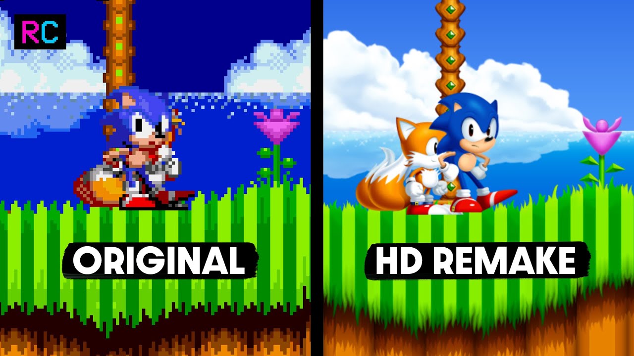
I don't know how anyone could think the left looks better than the right.
I dunno man, I never really played flash games because they are shit so it's hard for me to say. I think the only one I ever played was Dragonfable and it had pretty bad looking animation and I wasn't big on the art style they used. I don't think flash games are a fair comparison.KnightoftheWind wrote: ↑ May 11th, 2023, 23:57Man your tastes really suck ass. You're saying you prefer 2D Flash/Newgrounds style animation over quality sprite work?.
I hate pixels with a passion. I would be willing to spend like $10k if it would get me a 16k monitor and a video card that can drive it at high fps so I never have to see another pixel again.
- WhiteShark
- Turtle

- Posts: 2093
- Joined: Feb 2, '23
Right looks really flat and dull. Left has way more vivid colors: compare the gems in the totem pole, the contrast of the water to the clouds, the shadow below the turf, etc. I'm not a pixel supremacist but in this particular case the original is way, way better.GhostCow wrote: ↑ May 12th, 2023, 00:05I don't know how anyone could think the left looks better than the right.
- maidenhaver
- Posts: 4252
- Joined: Apr 17, '23
- Location: ROLE PLAYING GAME
- Contact:
Depends how far from the screen my fat ass is sitting.
Really weird thing to say when the right side has shading to give it depth and the left doesn't.
We'll just have to disagree on the colors I guess. I think they look fine in either version, although the gem you pointed out is another thing I find a little weird. I'm not really a fan of that pukey neon green color. That color would probably signal something you should stay away from in nature.WhiteShark wrote: ↑ May 12th, 2023, 00:18Left has way more vivid colors: compare the gems in the totem pole, the contrast of the water to the clouds, the shadow below the turf, etc.
- BosanskiSeljak
- Posts: 24
- Joined: May 7, '23
Agreed. When I see it nowadays I know its some RPGMaker trash or some wannabe JRPG indie garbage that a bunch of geeks suck offGhostCow wrote: ↑ May 11th, 2023, 23:19Personally I think all pixel art looks terrible and should be left to the confines of history.
Maybe one day I'll have enough money that someone might like me a little bit.
Absolutely soulless.GhostCow wrote: ↑ May 12th, 2023, 00:05
It's an old mockup from many years ago. I always thought it looked great and I had to google my ass off to find it. There is however an actual Sonic 2 HD remake being made by fans and it looks like this:
I don't know how anyone could think the left looks better than the right.
I hate pixels with a passion. I would be willing to spend like $10k if it would get me a 16k monitor and a video card that can drive it at high fps so I never have to see another pixel again.
Having a soul is overrated. Dollar bills is where it's at.
- rusty_shackleford
- Site Admin
- Posts: 10235
- Joined: Feb 2, '23
- Contact:
The bouncing animations remind me of Adam Sessler tweaking.
How long ago did this start? Here's a clip of designers talking about doing exactly this:
- rusty_shackleford
- Site Admin
- Posts: 10235
- Joined: Feb 2, '23
- Contact:
Subtle breathing can be fine. The problem is that it tends to look bad on pixel art, and that's not what these characters are even doing. They're just bouncing in place.Acrux wrote: ↑ May 12th, 2023, 03:10How long ago did this start? Here's a clip of designers talking about doing exactly this:
[media]https://youtube.com/clip/UgkxELnv6dJCnC ... UStatvXTIb[/media]
The problem is that bullying them will just make designers make sure they bounce even harder and more annoyingly because someone is getting off on it.
- WhiteShark
- Turtle

- Posts: 2093
- Joined: Feb 2, '23
Genuine question: do you not see the shading in the left one? It's there and more distinctive than the one on the right to my eyes.GhostCow wrote: ↑ May 12th, 2023, 00:50Really weird thing to say when the right side has shading to give it depth and the left doesn't.
- General Reign
- Posts: 1030
- Joined: Feb 6, '23
- Location: Scorched Earth
I tell you what pixel art I did not like...Blasphemous. It almost seems like too many frames of animation if that makes sense.
I can see a little bit on Tails' tail but that's it. I have to look hard to see it since everything is made out of so few pixels. I also see a couple of shadows, which isn't the same thing.WhiteShark wrote: ↑ May 12th, 2023, 03:56Genuine question: do you not see the shading in the left one? It's there and more distinctive than the one on the right to my eyes.GhostCow wrote: ↑ May 12th, 2023, 00:50Really weird thing to say when the right side has shading to give it depth and the left doesn't.
I'm now starting to question if people who like pixelshit are filling in the gaps with their imagination instead of actually seeing what the art looks like.
A majority of what you see is just imitating other products for the sake of imitating.
As for why this happened, I would say it's probably a bandaid applied to address problems caused by poor art direction. It is very common in games today to see no discernible difference in contrast or lighting between interactive and background elements. Giving sprites a perpetual seizure solves the readability issue.
- Segata Sanshiro
- Turtle

- Posts: 1644
- Joined: Feb 2, '23
People played left on a CRT, so it didn't look like that.GhostCow wrote: ↑ May 12th, 2023, 00:05Image
I don't know how anyone could think the left looks better than the right.
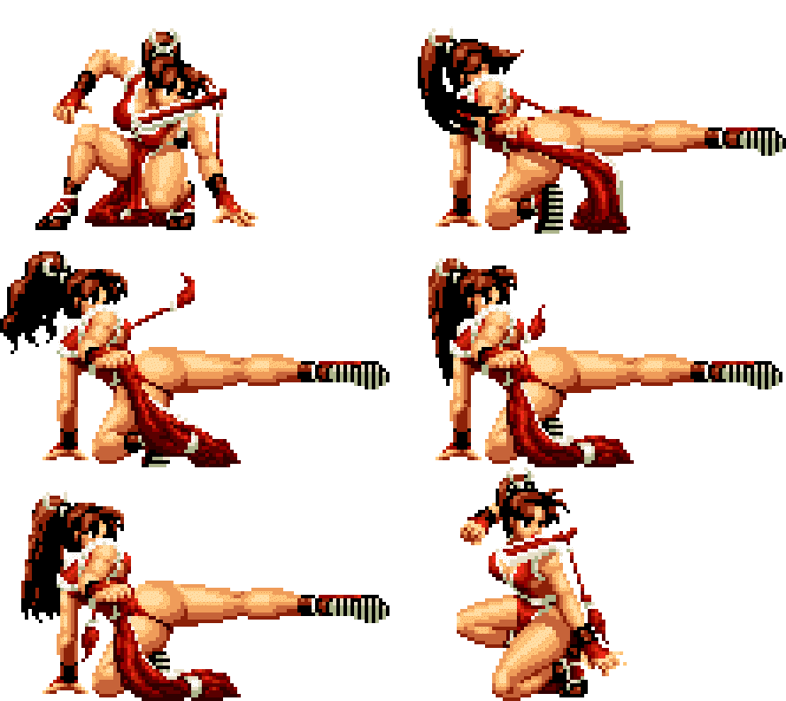
Anyways, this thread is about animations. And this is the right kind of bouncing:
- KnightoftheWind
- Posts: 1618
- Joined: Feb 27, '23
Ah the good old days of gaming...Segata Sanshiro wrote: ↑ May 12th, 2023, 19:38People played left on a CRT, so it didn't look like that.GhostCow wrote: ↑ May 12th, 2023, 00:05Image
I don't know how anyone could think the left looks better than the right.
Anyways, this thread is about animations. And this is the right kind of bouncing:

- madbringer
- Turtle

- Posts: 526
- Joined: Apr 4, '23
- Location: the vast
Personally, I like pixel art just purely for aesthetics, but it has been grossly abused and overused by lazy indie dev cunts to the point I can see why people get sick of it. Shitty pixel art or unity model reskins, pick your poison.GhostCow wrote: ↑ May 11th, 2023, 23:19Personally I think all pixel art looks terrible and should be left to the confines of history.
inb4 someone posts a bunch of screenshots from their favorite 2d era console. Sorry, you're not going to convince me.
