

I don't like that the page reloads when clicking on the like button.
Post some other minor nitpicks you have here.
We have a Steam curator now. You should be following it. https://store.steampowered.com/curator/44994899-RPGHQ/
The nitpicks thread
-
rusty_shackleford

- Site Admin
- Posts: 10854
- Joined: Feb 2, '23
- Gender: Watermelon
- Contact:
-
WhiteShark

- Turtle

- Posts: 2192
- Joined: Feb 2, '23

-
rusty_shackleford
- Site Admin
- Posts: 10854
- Joined: Feb 2, '23
- Gender: Watermelon
- Contact:
@twig are you aware of any ajax notifications support for phpbb?

Adding: When someone clicks “RPGHQ,” it takes the user to the homepage.WhiteShark wrote: ↑ February 4th, 2023, 16:52I don't like the space in RPG HQ at the top of the page.
Last edited by Nemesis on February 4th, 2023, 19:39, edited 1 time in total.
-
WhiteShark
- Turtle
- Posts: 2192
- Joined: Feb 2, '23
There's a fair bit of empty space in the bar at the top. I think it would be convenient if some of the options in the "Quick Links" menu were moved out into the bar, especially Search and Members.
Edit: I'm using proSilver Dark, if it matters.
Edit: I'm using proSilver Dark, if it matters.
Remove "edited X times in total."
Fine to leave a timestamp of last edit, but I don't see a need to show a count.
Fine to leave a timestamp of last edit, but I don't see a need to show a count.
-
WhiteShark
- Turtle
- Posts: 2192
- Joined: Feb 2, '23
Show more posts per page. I didn't count the exact number but I see threads going to page 2 with very few posts total. I didn't see a setting to change that on my end.
Skip the confirmation page after changing a setting. Right now it takes you to a page saying it succeeded and it doesn't seem to redirect, so you have to click the link to get back to the settings page.
Skip the confirmation page after changing a setting. Right now it takes you to a page saying it succeeded and it doesn't seem to redirect, so you have to click the link to get back to the settings page.
-
WhiteShark
- Turtle
- Posts: 2192
- Joined: Feb 2, '23
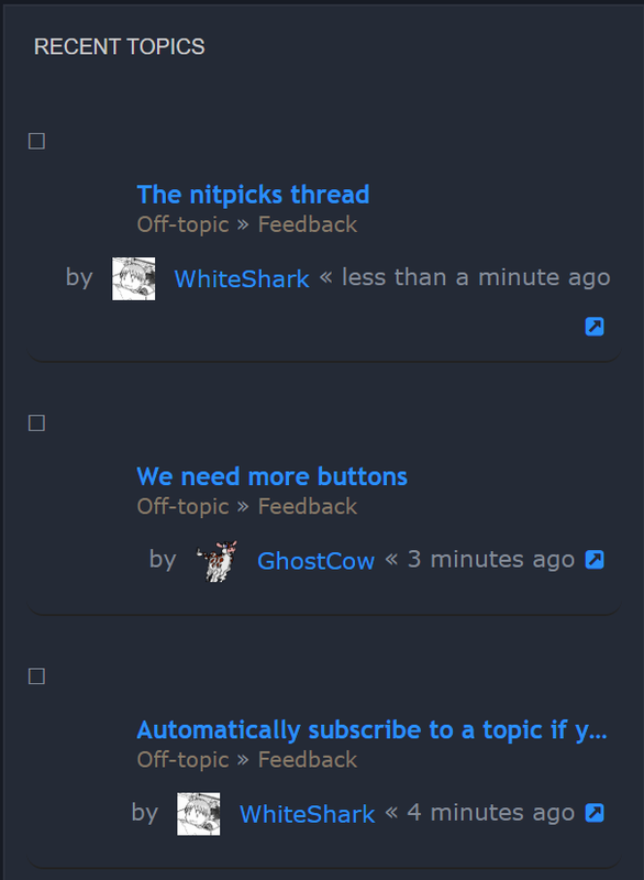
Recent topics feed on the right has a lot of empty space. Looks like it could easily be compressed.
Also, this blinding white background in proSilver Dark for the spoiler box is kind of lame.
► Show Spoiler
-
rusty_shackleford
- Site Admin
- Posts: 10854
- Joined: Feb 2, '23
- Gender: Watermelon
- Contact:
Let me know how the recent topics is now, I suspect it's only partly fixed but wanted to see if that helps before I fix the rest.WhiteShark wrote: ↑ February 5th, 2023, 06:23Recent topics feed on the right has a lot of empty space. Looks like it could easily be compressed.Also, this blinding white background in proSilver Dark for the spoiler box is kind of lame.► Show Spoiler
-
rusty_shackleford
- Site Admin
- Posts: 10854
- Joined: Feb 2, '23
- Gender: Watermelon
- Contact:
-
rusty_shackleford
- Site Admin
- Posts: 10854
- Joined: Feb 2, '23
- Gender: Watermelon
- Contact:
FYI I'll only be supporting the prosilver_dark theme as I consider it to be the main theme. I think @twig might support a separate one, but that's up to him.
-
WhiteShark
- Turtle
- Posts: 2192
- Joined: Feb 2, '23
If something changed, I can't tell.rusty_shackleford wrote: ↑ February 5th, 2023, 12:25Let me know how the recent topics is now, I suspect it's only partly fixed but wanted to see if that helps before I fix the rest.
Spoiler background looks good now, thanks.rusty_shackleford wrote: ↑ February 5th, 2023, 12:41@WhiteShark tweaked the spoiler, let me know how it is now.

Is there something like the "What's New?" button from the old place? I used to scoff at it but it became useful.
-
rusty_shackleford
- Site Admin
- Posts: 10854
- Joined: Feb 2, '23
- Gender: Watermelon
- Contact:
Try again please, ctrl+shift+f5 to clear cache.WhiteShark wrote: ↑ February 5th, 2023, 14:55If something changed, I can't tell.rusty_shackleford wrote: ↑ February 5th, 2023, 12:25Let me know how the recent topics is now, I suspect it's only partly fixed but wanted to see if that helps before I fix the rest.Spoiler background looks good now, thanks.rusty_shackleford wrote: ↑ February 5th, 2023, 12:41@WhiteShark tweaked the spoiler, let me know how it is now.
-
rusty_shackleford
- Site Admin
- Posts: 10854
- Joined: Feb 2, '23
- Gender: Watermelon
- Contact:
Yes, I'll move it out onto the main bar. It's under "Quick links"Cedric wrote: ↑ February 5th, 2023, 15:18Is there something like the "What's New?" button from the old place? I used to scoff at it but it became useful.
-
rusty_shackleford
- Site Admin
- Posts: 10854
- Joined: Feb 2, '23
- Gender: Watermelon
- Contact:
Fixed some more things, if I missed something in this thread or another just ping me and I'll give it a first or second look.
-
WhiteShark
- Turtle
- Posts: 2192
- Joined: Feb 2, '23
Ah, yes, I forgot. It is smaller with the box at the top left of reach entry gone, but I believe it also told you whether there were unread posts in the thread, so it's a bit of a loss. Either way each entry still has a lot of wasted space.rusty_shackleford wrote: ↑ February 5th, 2023, 16:03Try again please, ctrl+shift+f5 to clear cache.
-
rusty_shackleford
- Site Admin
- Posts: 10854
- Joined: Feb 2, '23
- Gender: Watermelon
- Contact:
The little arrow next to it will be red or blue depending on whether it's unread or not.WhiteShark wrote: ↑ February 5th, 2023, 16:38Ah, yes, I forgot. It is smaller with the box at the top left of reach entry gone, but I believe it also told you whether there were unread posts in the thread, so it's a bit of a loss. Either way each entry still has a lot of wasted space.rusty_shackleford wrote: ↑ February 5th, 2023, 16:03Try again please, ctrl+shift+f5 to clear cache.
Also, try again, let me know.
-
WhiteShark
- Turtle
- Posts: 2192
- Joined: Feb 2, '23
That's much better! The only strange thing now is that some of the "by <user>" entries are left aligned and some are indented.rusty_shackleford wrote: ↑ February 5th, 2023, 16:44The little arrow next to it will be red or blue depending on whether it's unread or not.
Also, try again, let me know.
edit: And it doesn't seem to be regular. I see entries that are indented to varying degrees.
edit2: Ah, got it. They're all right-aligned, so the length of the username changes how far left they go.
When you hit the bell, there should be an icon (maybe a yellow star or asterisk) that’s shows the new responses. there’s not enough color contrast.
-
WhiteShark
- Turtle
- Posts: 2192
- Joined: Feb 2, '23
It seems you can't give titles to spoiler boxes. spoil="blah blah blah" still results in a generic spoiler.

-
rusty_shackleford
- Site Admin
- Posts: 10854
- Joined: Feb 2, '23
- Gender: Watermelon
- Contact:
The newsposting will continue until morale improves.
"Post approved" should have a message explaining why it's there, and what it takes to make it go away.
-
WhiteShark
- Turtle
- Posts: 2192
- Joined: Feb 2, '23
If you put a quote inside a spoiler, the font color becomes dark (presumably because originally the spoiler background would have been white) and this makes it hard to read. Demonstration:
► Show Spoiler
-
WhiteShark
- Turtle
- Posts: 2192
- Joined: Feb 2, '23
I think the Off-topic section and the Off-topic board should have different names for clarity.
-
rusty_shackleford
- Site Admin
- Posts: 10854
- Joined: Feb 2, '23
- Gender: Watermelon
- Contact:
Fixed.WhiteShark wrote: ↑ February 5th, 2023, 22:02If you put a quote inside a spoiler, the font color becomes dark (presumably because originally the spoiler background would have been white) and this makes it hard to read. Demonstration:► Show Spoiler