We have a Steam curator now. You should be following it. https://store.steampowered.com/curator/44994899-RPGHQ/

What makes modern games visually noisy?

No RPG elements? It probably goes here!
Post Reply
User avatar
rusty_shackleford
Site Admin
Posts: 10566
Joined: Feb 2, '23
Gender: Watermelon
Contact:

What makes modern games visually noisy?

Post by rusty_shackleford »

Just some observations.
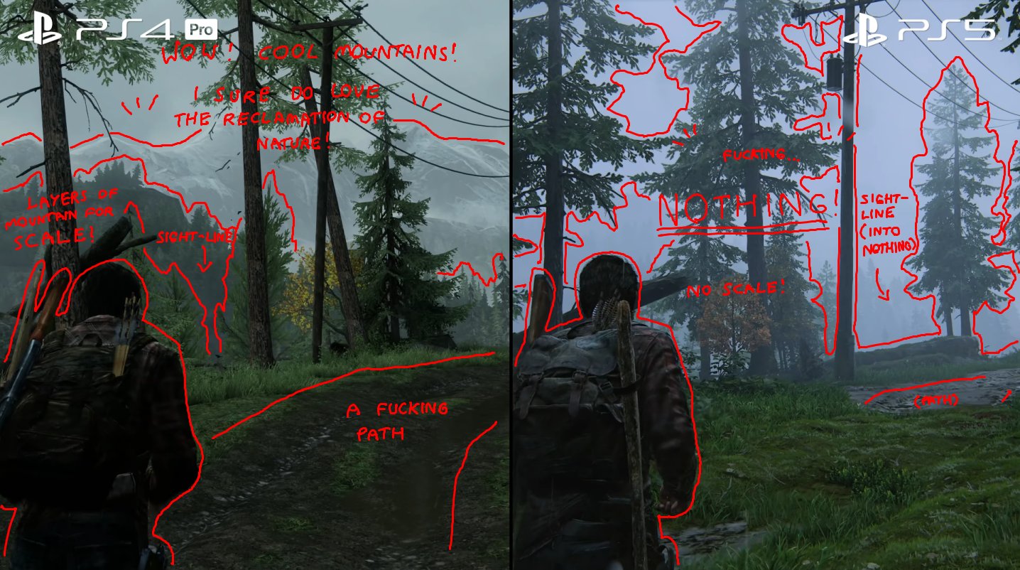
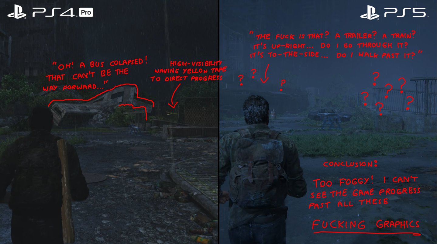
  1. PBR rendering AKA 'realistic' lighting. Video games used to entirely fake the lighting, just using some artistic approximation of what looks decent. And when it was too dark, they just cranked up the ambient light.
  2. Greebling. Artists are directly at odds with the designers, artists want their work to be interesting and stand out… which draws attention away from important details that the designer wants to be interesting and stand out.
Image
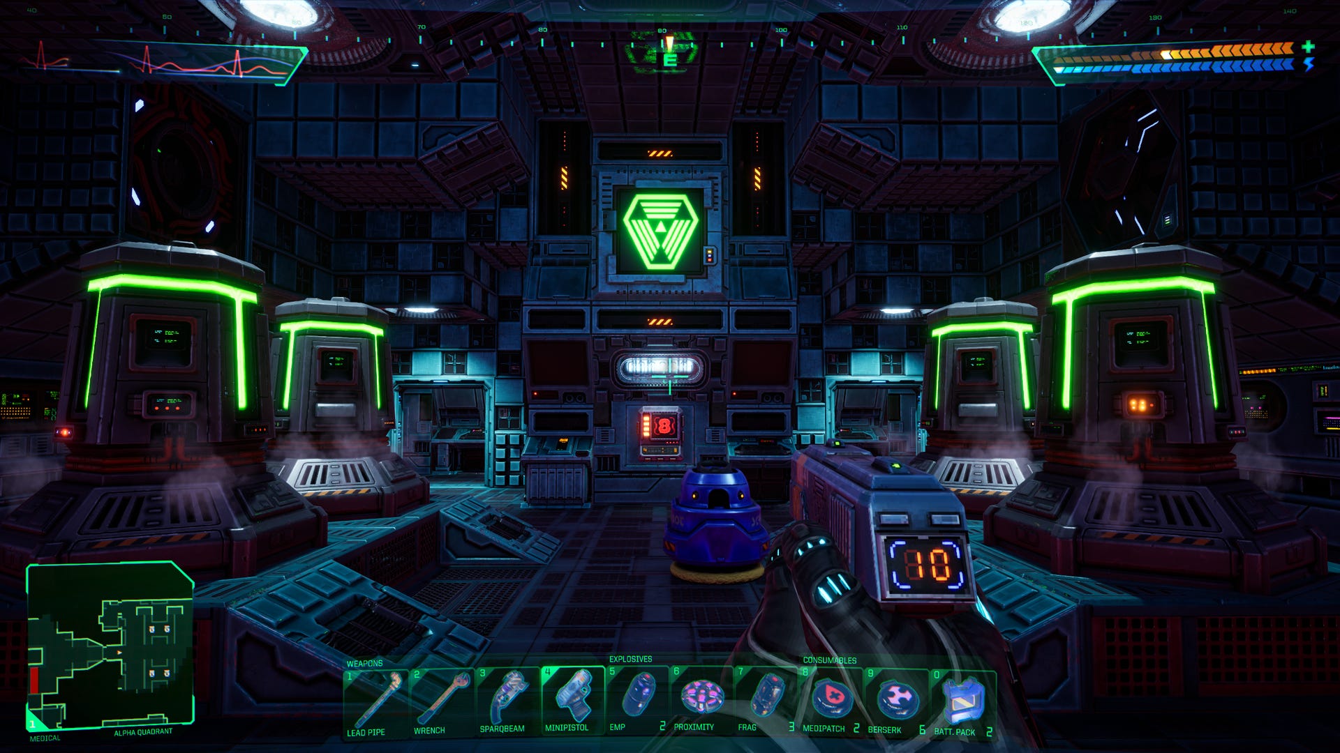
Look at all the various normal-mapped surfaces that have crevices/peaks just to look artistically interesting. These are intended to draw your eye, because the artist wants you to look at them. But they don't actually serve a gameplay purpose. The scene is visually busy.

Image
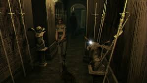
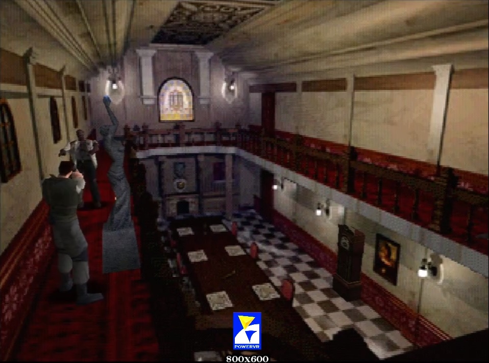
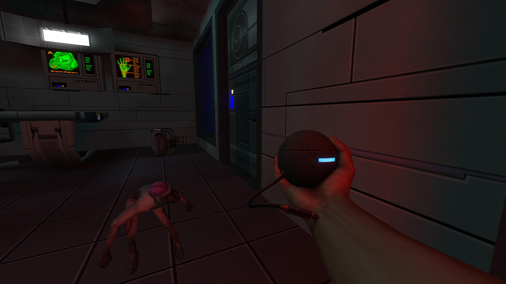
(Perhaps a bit unfair as this is the enhanced edition, but old games at high resolution tend to be extremely 'clean')

With regards to #1, I actually think the issue here is most games aren't using enough light bounces when baking the lighting and/or rely entirely on real-time GI. Those lights should be contributing significantly more to the overall brightness levels rather than just lighting up their immediate area. Perhaps this is due to a lack of training with the tools, or bad documentation.

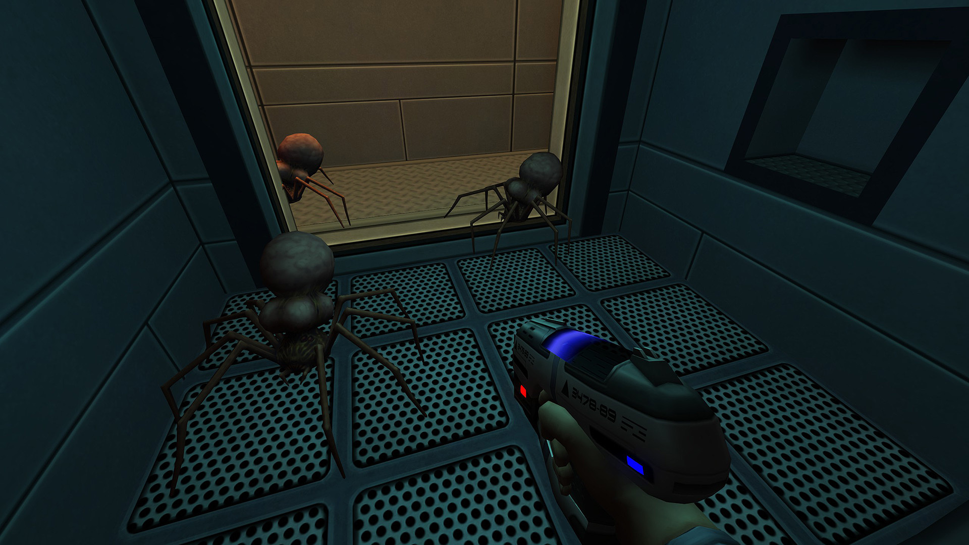
I don't agree with the notion that the UI is tied to this, not in most cases anyways. The bottom one actually has a busier UI.

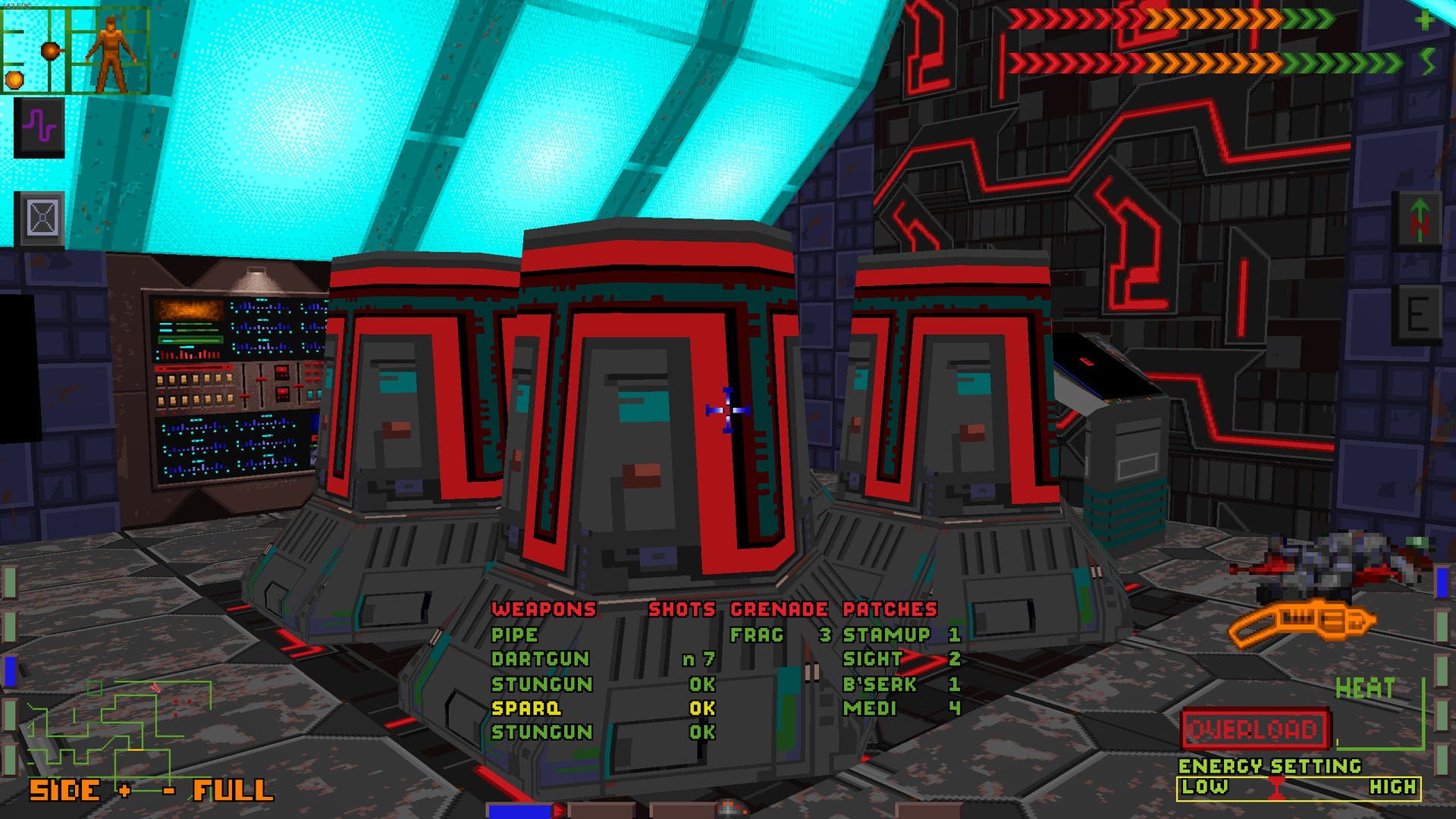
Of course, early true 3D games tend to be even better at visual clarity.
Image
Image
I find these early 3D games combined with modern high resolution textures to be an ideal for me. Note the ambient lighting ensuring a minimum level of brightness to prevent anything from being overly dark.

(Grabbed these from the GOG page for System Shock 2 Enhanced, feel free to post some more early 3D stuff highlighting visual clarity)
Last edited by rusty_shackleford on April 26th, 2024, 07:05, edited 8 times in total.
User avatar
Cogemeister
Posts: 57
Joined: Apr 23, '24

Post by Cogemeister »

Excessive HUD ruins an otherwise good looking game, especially more open world or FPS games.
User avatar
wndrbr
Turtle
Turtle
Posts: 1370
Joined: Feb 4, '23
Location: Mongolia
Gender: Dinosaur

Post by wndrbr »

Artists are directly at odds with the designers, artists want their work to be interesting and stand out… which draws attention away from important details that the designer wants to be interesting and stand out.
i think this is pretty much the main reason it happens. Back when the levels were sculpted out of brushes it was easy for the level designers to do everything by themselves, i.e. a level designer did a block-out, then turned it into a proper level, then added props and other graphical details. Nowadays it's all being handled by a bunch of people, and the "art pass" is probably done by artists and not the gameplay-designers.

The overall fidelity of the graphical assets is also to blame here, since back in the late 90s/early 00s due to the limited polygon/texture budget it was easier to immediately distinguish the important environmental elements as they tended to look more detailed.

Nowadays it is so hard to distinguish between interactable elements and the set dressings, the devs resort to various crutches and hack solutions such as ugly hud (Resident Evil Remakes are the worst offenders with their garish item highlighting icons) or 'diegetic' elements that despite being diegetic still look wildly out of place (like how in Tomb Raider 2013 every climbable surface is covered in white paint, cuz otherwise it's too difficult to decide whether you can climb on this ledge, or is it just a prop that was put here for the level to look good).
User avatar
wndrbr
Turtle
Turtle
Posts: 1370
Joined: Feb 4, '23
Location: Mongolia
Gender: Dinosaur

Post by wndrbr »

The only solution here is to return to monke 2004-level of visual detail.
User avatar
Metalhead33
Posts: 318
Joined: Feb 26, '24

Post by Metalhead33 »

TSAA (Temporal anti-aliasing) makes modern games blurry and noisy.

To an extent, it is a necessary evil, because the only alternative is:
a) FSAA, which completely kneecaps performance
b) No anti-aliasing at all, which leads to dithering artifacts becoming noticeable.
c) No anti-aliasing and no dithering at all, which necessitates the use of other, costlier (or less reliable) algorithms to resolve transparency issues

I'm a programmer who dabbled in 3D rendering, and trust me, sorting transparent triangles is a real bitch. I'd rather just fake transparency using ordered dithering, and then slap some anti-aliasing algorithm to blur away the dithering artifacts, faking real transparency. Most real-life transparent surfaces - such as glass and water - blur whatever is behind/under them anyway.
Last edited by Metalhead33 on April 26th, 2024, 08:07, edited 2 times in total.
User avatar
gerey
Turtle
Turtle
Posts: 929
Joined: Feb 2, '23

Post by gerey »

wndrbr wrote: April 26th, 2024, 07:17
Nowadays it is so hard to distinguish between interactable elements and the set dressings, the devs resort to various crutches
Was that not the case in the past as well? Or better said, the crutch wasn't necessary because interactable elements stood out from the lower-fidetly backgrounds enough to be noticeable. In old Resident Evil games interactable objects were 3D on a prerendered background and were easy to spot, being noticeably brighter than the background itself. Alternatively, devs would add a "shine" effect to draw players to objects.

Look at how immersive old classics were! (also sorry for the shitty image quality, was too lazy to hunt down better screenshots)

Image
Image

And that's ignoring obvious uses of colors or lights to guide players towards parts of the map or specific items.

I think the whole issue is overblown and a terminal case of gamer hipsterism. RE4, since its remake is what started the whole debate, was no less subtle about cluing players into the fact what was interactable and what is not - from brighter pickups, color-coded random drops and shining interactable objects, but now yellow paint is somehow an issue.
User avatar
wndrbr
Turtle
Turtle
Posts: 1370
Joined: Feb 4, '23
Location: Mongolia
Gender: Dinosaur

Post by wndrbr »

gerey wrote: April 26th, 2024, 08:21
RE4, since its remake is what started the whole debate
i meant RE2 & RE3 remakes, since the originals didn't have any hud. It would've been fine if capcom used the shine, but they went for an ugly-ass floating icon for some reason.

I give RE4 a pass since it's a very arcadey and "gamey" game.
User avatar
rusty_shackleford
Site Admin
Posts: 10566
Joined: Feb 2, '23
Gender: Watermelon
Contact:

Post by rusty_shackleford »

I've only played a single resident evil game and it was for less than an hour so I've got no idea what you guys are on about.
User avatar
gerey
Turtle
Turtle
Posts: 929
Joined: Feb 2, '23

Post by gerey »

rusty_shackleford wrote: April 26th, 2024, 08:46
I've only played a single resident evil game and it was for less than an hour so I've got no idea what you guys are on about.
Your failure is duly noted.
User avatar
rusty_shackleford
Site Admin
Posts: 10566
Joined: Feb 2, '23
Gender: Watermelon
Contact:

Post by rusty_shackleford »

gerey wrote: April 26th, 2024, 08:21
I think the whole issue is overblown and a terminal case of gamer hipsterism. RE4, since its remake is what started the whole debate, was no less subtle about cluing players into the fact what was interactable and what is not - from brighter pickups, color-coded random drops and shining interactable objects, but now yellow paint is somehow an issue.
Yellow paint isn't used to address this, it's used for a similar — but not the same — issue. You understand the reason yellow paint is used when you understand why BG3 doesn't need yellow paint: BG3 isn't hollywood props, if you see it you can almost always interact with it in some way therefore they don't need to tell you what can be interacted with. Same deal with so-called "immersive sim" games, they don't need to highlight things you can interact with because you assume you can interact with the environment by default.
The yellow paint is used to tell you something isn't just a prop but a gameplay element.
User avatar
Element
Posts: 450
Joined: Jul 23, '23

Post by Element »

Lack of an authoritarian 'cinematographer' role to unify and filter out the elements that are not in accord with his artistic vision. Lead visual artists seem far less prominent, unless they're swaying the director (eg. Shinkawa and Kojima).

It may also be a problem with concept art, since it's laden with dramatic lighting to 'set the tone' and the 'mood'. Doesn't translate well at all into an interactive medium. Lighting artists/leads I presume are roles for people who simply make sure that the final product aligns with what the art department drew up in the early stages.
User avatar
gerey
Turtle
Turtle
Posts: 929
Joined: Feb 2, '23

Post by gerey »

rusty_shackleford wrote: April 26th, 2024, 08:52
The yellow paint is used to tell you something isn't just a prop but a gameplay element.
I was mostly responding to wunderbar's comment about devs resorting to bright colors/light to highlight which objects are interactable and which are not in the overmatured environments of modern games - that what RE4R did was nothing new to the franchise as a whole, and had in fact been an element since the very first game.
they don't need to highlight things you can interact with because you assume you can interact with the environment by default
That's comparing apples to oranges though. Not all games allow players to interact and manipulate (nearly) all elements of the environments, and nor should they.

I don't disagree with your point though, a lot of modern games do assault the player with too much visual noise. The SS1 remake is a particularly egregious example.
User avatar
wndrbr
Turtle
Turtle
Posts: 1370
Joined: Feb 4, '23
Location: Mongolia
Gender: Dinosaur

Post by wndrbr »

So this thread is another one of Rusty's stealth attempt at shilling BG3.
User avatar
LemonDemonGirl
Posts: 90
Joined: Dec 8, '23
Location: Canada
Gender: Lemon

Post by LemonDemonGirl »

Overdetailed textures
User avatar
rusty_shackleford
Site Admin
Posts: 10566
Joined: Feb 2, '23
Gender: Watermelon
Contact:

Post by rusty_shackleford »

they're both shit.

if you need to draw red lines to make your point, you're doing the same exact thing as yellow paint
Last edited by rusty_shackleford on April 26th, 2024, 21:19, edited 1 time in total.
User avatar
Roguey
Turtle
Turtle
Posts: 615
Joined: Feb 4, '23

Post by Roguey »

rusty_shackleford wrote: April 26th, 2024, 21:19
they're both shit.

if you need to draw red lines to make your point, you're doing the same exact thing as yellow paint
Poster was just being overly illustrative to make a point.
User avatar
Anon
Posts: 1862
Joined: Jan 6, '24
Gender: Lemon

Post by Anon »

Roguey wrote: April 26th, 2024, 21:24
rusty_shackleford wrote: April 26th, 2024, 21:19
they're both shit.

if you need to draw red lines to make your point, you're doing the same exact thing as yellow paint
Poster was just being overly illustrative to make a point.
visually noisy*
User avatar
rusty_shackleford
Site Admin
Posts: 10566
Joined: Feb 2, '23
Gender: Watermelon
Contact:

Post by rusty_shackleford »

Roguey wrote: April 26th, 2024, 21:24
rusty_shackleford wrote: April 26th, 2024, 21:19
they're both shit.

if you need to draw red lines to make your point, you're doing the same exact thing as yellow paint
Poster was just being overly illustrative to make a point.
No point was made, without the lines they're both hard to make out.
But I'm not sure if that's even a knock against the game, it's meant to be overgrown, cluttered, and hard to discern — as far as I understand, anyways. Visual noise is actually a good design choice for a post-apoc horror(?)/stealth/survival(?) game.
Last edited by rusty_shackleford on April 26th, 2024, 21:28, edited 2 times in total.
User avatar
gerey
Turtle
Turtle
Posts: 929
Joined: Feb 2, '23

Post by gerey »

rusty_shackleford wrote: April 26th, 2024, 21:27
But I'm not sure if that's even a knock against the game, it's meant to be overgrown, cluttered, and hard to discern
The funny thing is, for all the criticism you can throw at the game, being bad at directing the player is not one issue the original TLOU1 has. At no point did I ever wonder where I had to go next, usually because the game is very linear, but also because Naughty Dog did a really good job with camera framing, environmental cues and other tricks to direct the player in the right direction.

Granted, there were also plenty of instances where the game uses companion NPCs as a crutch to spell the solution out for the player, and then incessantly nag them until they proceed.
Post Reply